Notice anything different about your brand’s Facebook page? Consider the orange pendant your warning flag: You’ve got until March 30 to get your page spick-and-span for its Timeline debut. New features mean you’ll have more control of your page, with more ways to up engagement. Learn what it all means and how to make most the new layout by following these 10 quick steps.
NOTE: Click on the “preview” button at the top of your page and presto chango! You can now follow along with all these newfangled terms.
1. Cover Photo
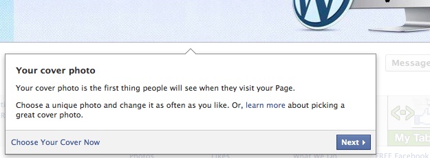
Your cover photo is the first thing everyone will see when they land on your page. If you’re in preview mode, you may not notice it right away. Click “Add a Cover” and upload a photo and see what happens.
You’ll notice the photo displays as a landscape and may cut off important elements you want to appear. Click on the cover and it expands. Because of the layout, you may find yourself fiddling more than you ever had to with your profile photo. Chalk it up under the practice-makes-perfect category.
You can have text within the graphic, but Facebook recommends avoiding all-text cover photos (and we do, too—no one wants to read a lot, anyway). Try different options until you get it just right; you’re not married to the first thing you try.
See what engages your visitors, and think about it from their point of view: If you were visiting your own page, what would get you to scroll past the cover photo to your updates? Just be sure you read Facebook’s rules about what you can and can’t use within this space.
2. Profile Photo
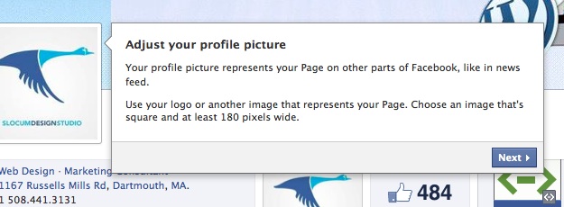
You’re profile photo hasn’t gone anywhere. In fact you may not notice it’s changed at all. It’s smaller and it’s a square, so you may have to adjust your current photo slightly (this may be as simple altering what is cropped).
As with the cover photo, if you click on the profile photo it will expand to its full size. If it isn’t already, you should consider making your profile photo your logo or some other image that customers associate with your brand.
3. About
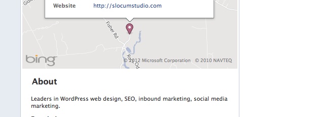
The about section on your page already exists. With the new format, it slides from the left sidebar under your profile photo to a more prominent area (still under your profile photo). You want to use this area to be a quick-hitting description of your brand. Or maybe you use it to display your company’s hours. Play around with different information and see how it looks.
Underneath this section is “About” text link. Click this and you’ll get to a page with more details. This section also already exists on your current page under the “Info” tab. Hover over the top right corners of the about, basic info., and contact us areas to see the option to edit.
For inspiration, check out brands like Starbucks and Coca Cola to see how they’re tackling the new format.
4. Photos, Likes, Apps
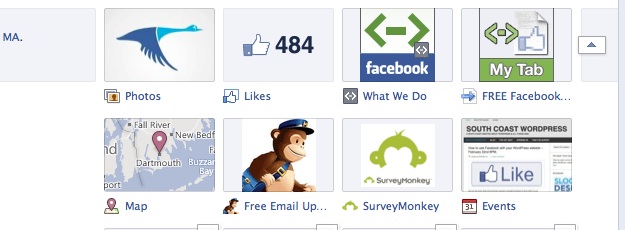
You can show a maximum of 12 applications at once, so make sure the most important are showing. On top of that, only 4 will show until a user clicks on the half-box at the end of the row (and chances are, they won’t click on it).
If you’re new to Facebook or your company has no branded applications, this is less of an issue. You probably have photos and likes showing (and maybe events and videos, if you have any). If that’s the case, there’s no need to take any action, but it’s good to be aware down the line.
Perhaps you want to have the map show up to pinpoint the locations of your business(es). Or maybe you have a loyalty program application. Consider your top 4 and make these your priority; the other 8 will take a backseat to these (and, chances are, will see minimal engagement).
5. Highlighting (and Hiding)
Hover over any post on your page and you’ll see a star icon and a pencil icon.
Click the star icon on a particular story and it’ll expand the story take up the entire width of the page. Use this tool for photos you want to display larger or content you want to draw attention to; the format will create a roadblock of sorts, forcing users to pause.
Click on the pencil icon and you have more options. Pin a story to the top of your page, change a date of a post, hide a post, or delete a post completely. Why would you want to do any of these things?
Pin a story to the top of the page if you want to draw attention to a piece of content for a longer period of time (you’ll see a small orange ribbon marks the post). Unpin it, and it’ll go back to its original place on the page.
Hide posts if you don’t want the public to see them, but you don’t want to get rid of it completely. Maybe you want to prep a story for the next day; you can hide it and unhide it when you’re ready. Find hidden posts within your admin panel under “manage” and “activity log.”
Have a story that was a flop? One no one understood or engaged with? It happens. And now you can delete it and pretend like it never happened, making more room on the page and drawing attention to the information that is more important and relevant to your audience.
Hiding and deleting posts is also particularly handy for spam comments or unruly users who are violating your Facebook policies.
6. Admin panel
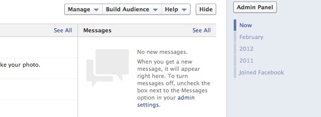
This new section puts all your notifications, likes, messages, and statistics (or “insights”) in one place. Keep track of what content your audience is engaging with and ensure you’re keeping conversations active. This area makes it easy to stay on top of any questions or comments that your customers have posted, ensuring you reply in a timely manner.
Use the page insights to find out when people are visiting your page. You can then aim to post more during those hours.
Under the “manage” tab, you’ll find the “activity log” mentioned above. Here you can see everything you’ve ever posted or commented on—all your activity in one place. If your brand has been around for a while, it may take some time to go through and pick and choose what to highlight, hide, or delete; think of yourself as a museum curator. Each interaction has a small circle on the far right of each line. Click it and find options to unhide hidden posts, delete posts, highlight posts, and more.
This is a section you’ll want to come back to often, perhaps once a week or once a month. By going through and doing a sweep of all your interactions, you’ll stay on top of your page, ensuring your brand is always displayed in the most positive possible way. Manage it in weekly or monthly chunks and it’ll be less daunting in the future. We equate it to spring cleaning: No one likes spring cleaning; it’s too much all at once.
7. Messages
If you have a personal Facebook page, you probably know how this works. If not, it’s essentially like having a hybrid of email and an instant message service on Facebook. Messages stack like a text or instant message, but it’s more like email in that you probably have to log-in to Facebook to get the messages (unless, of course, you get instant updates on your iPhone or Droid, but we won’t get into that).
So why does it matter for your business? It’s another way you can connect with customers, and one that is more personal and offers more privacy. And let’s face it—sometimes someone poses a question on your wall that deserves a more in-depth explanation.
You can hide this button, but think before choosing to close off another channel of communication between you and your customers. Click “manage” and “edit page” from the admin panel; you’ll see the option of eliminating the message button from your page.
8. Friend Activity
You have little control over what shows up in this area. Users will see their friends that like the brand. Below thumbnails of their friends’ photos, they’ll see recent activity their friends have had with the brand, or they may see a general “recent posts by others” section.
You do have the option of deleting posts, but be careful. If someone is cursing or ranting about something unrelated to your brand, it’s safe to delete.
However, just because someone disagrees with something your company has said or done, doesn’t mean you should automatically delete the post. Customers may be full of negativity, but you also have a responsibility to do your best to diffuse the situation. After all, deleting someone’s post runs the risk of enraging them even more; they’re already on Facebook, so you can be sure they’ll post a status update and all their friends will get a bad perception of your brand, warranted or not.
9. Milestones
In the area where you usually post status updates, photos, and videos, there’s now a “milestone” option. This is the place to add important milestones in your brand’s history. When were you founded? When did you launch your website? When did your new CEO start? Anything you can think of you can add. Humor can go a long way, though we recommend staying away from updates such as “Found out mascot was allergic to peanut butter” or “Store was robbed.”
What’s the point, you ask? Well, timeline is a timeline after all. It’s your chance to collect your entire history in one place and share it with your customers. Maybe they all won’t read it (in fact, we can guarantee that most won’t), but it can be helpful for you, your employees, and the occasional extra-interested customer (never discount the power of boredom). That said, pick and choose what you share wisely. You can take it back, but chances are someone’s already seen it.
10. Publish Timeline
Feel like your page is ready to share with the world? Click the green “Publish Now” button and your page will be in its new format forevermore. While that may sound a bit dramatic, it’s not. You can still edit, update, and change your page as usual.
Of course you don’t have to publish your new layout immediately. Take your time. Make sure you’re happy with your final product. And remember, you can always wait until March 30 when Facebook will make the switchover for you.

