
OLD WEBSITE | NEW website


The new Hercules website above right includes a video that fills the upper part of the screen. And there's is a good use of color and graphics in the center.
The previous Hercules Marine Supply website was built about 4 years old. So in internet time that might mean it was 20 years old– probably older. Now I made that up, but you won't find an accurate measure of human time verses internet time on the web, no fancy charts or graphics.
A lot has changed in web design and development since 2015 there are more websites and owners are looking for top page placement. This requires a blend of design and functionality and keywording.
Read more below to see how we designed some unique features into this new website.
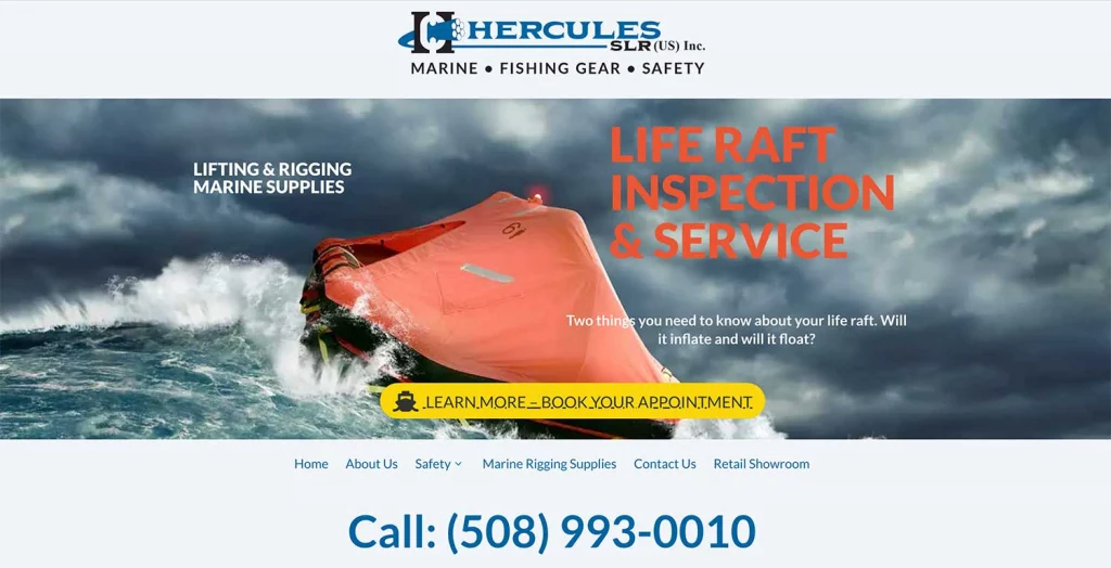
Let's start this case study off by first comparing the two home pages (above the fold). In the new design (above), we have made the following upgrades.
- Included a video upper banner image
- A large yellow LEARN MORE button
- Menu in the center under the banner image
- Large on-center phone number
- Large on-center logo
- Main text call to action
These actions alone will help the website convert. Just in terms of User Experience.

Benefits of a Redesign
The Goal
In the case of Hercules SLR, like most owners, they wanted to generate more leads coming from their new website. Both in terms of contact forms, and phone calls. They had also asked us to review competitor websites and report back with a plan of action as to how they could compete more effectively.
The Process
We determine (with the owner's input), what the main services or products are that they sell. So it's important when you first think of doing a redesign (wireframe) that you prioritize or rank the hierarchy of your services or product based on the revenue that each brings in. Or rank the work/service that you enjoy doing the most first. We give you a more detailed direction in our discovery session.
A well developed and designed website that is optimized can generate a good amount of business for you. It still ranks as one of the best investments that you can make for your business.
The Results
Comparing Hercules's websites graphics above one can easily see that the new site has ten times more content and is rich in graphics that are "designed in" to engage a potential visitor. To enhance the user experience we have broken down the services that Hercules offers. Lifting and rigging, Survival training, Products, and Life raft sections are clearly defined.
As you move through the website you'll notice that each panel (as in this example), the Lifting & Rigging section has excellent graphics and informative content. And each includes a CTA (call to ![]() action button) like the one you see here on the left.
action button) like the one you see here on the left.
Clicking this button takes you to the interior rigging page.
Header tags and a mix of colors are also an important part of the equation. As you can see we blend orange, blues, and grays both for effect and separation.
If your thinking of doing a redesign and need help contact us today we would be happy to learn of what you're planning! call at 508-441-3131. Or, fill out the form below!