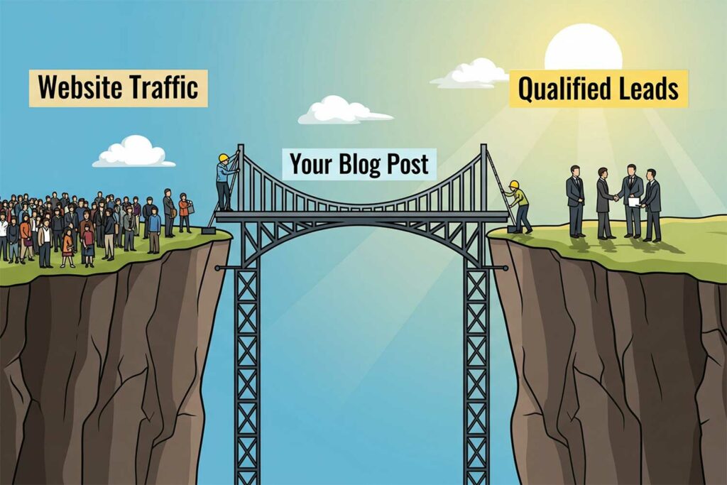
Every website piece—from blogs to product pages—should do more than draw eyes; it must spur action. “
Content engagement strategies ” zero in on crafting messages with one goal: to turn casual visitors into buyers, subscribers, or leads. In this section, we’ll unpack five pillars that define conversion‑driven content—the start of your journey into web content management.
- Defining Conversion‑Driven Content explains why conversion isn’t an afterthought but the very purpose of each sentence.
- Key Metrics That Matter highlights the numbers—CTR, average order value, time on page—that reveal whether your content hits the mark.
- Turning Browsers into Buyers explores tactics that nudge a reader from interest to decision, like social proof and clear next steps.
- Psychology Meets Performance: The Secret Sauce dives into the mental triggers—urgency, scarcity, reciprocity—that make CTAs irresistible.
- Why Every Word Needs a Purpose argues that in a world of short attention spans, fluff is the enemy of conversion: every line must do heavy lifting.
These five facets form the blueprint for “content that converts.” By the end of this section, you’ll see how to shift from generic information dumps to tightly focused, action‑oriented narratives that guide each reader toward your desired outcome.
Who is this for?
- Small business owners who have invested in a website but aren’t seeing new leads.
- Marketing managers at medium-sized businesses are tasked with improving website ROI.
- Any professional who needs their website to be more than just a digital brochure.
Content engagement strategies
Defining Conversion‑Driven Content
Conversion‑driven content is any text or media intentionally designed to motivate a specific action—signing up, buying now, downloading a guide. Unlike standard blog posts that aim for awareness, this content has a built‑in “ask” and structures itself around it. Imagine a landing page: every headline, paragraph, and image funnels toward a single button—“Start My Free Trial.” You should always consider content engagement strategies when making a blog post or a web page.
That clarity of purpose defines conversion content.
Such content begins with clearly understanding the visitor’s need and ends with a friction‑free next step. It avoids generic statements and instead zeroes in on benefits and outcomes. For instance, rather than explaining features (“Our software has X, Y, Z”), you pivot to results (“Save two hours daily by automating X with our tool”).
This shift from “what it is” to “what it does” turns curiosity into commitment. In short, conversion‑driven content treats every word as a mini CTA, building a narrative that naturally crescendos at your primary conversion goal. Here at Slocum Studio, we strive to do better with our content engagement strategies.
Key Metrics That Matter (CTR, AOV, Time on Page)
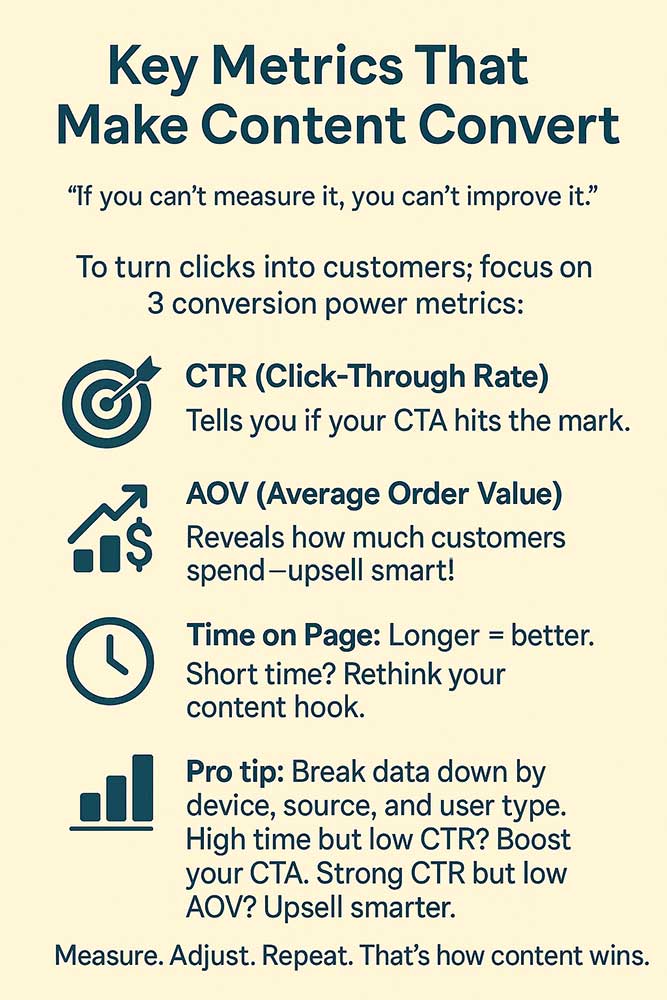
If you can’t measure it, you can’t improve it. Conversion content demands a laser focus on key metrics:
Click‑Through Rate (CTR): The percentage of readers who follow your CTA link. A high CTR tells you the messaging resonates.
Average Order Value (AOV): The typical spend per transaction. Uplifting AOV through persuasive cross‑sells is prime conversion work.
Time on Page: Longer sessions often indicate engaging, relevant content. If readers bounce in seconds, you may be missing the mark.
A graphic showing Key Metrics that Make Content Convert
Why Slocum Design Studio?
Talk to Us! Call: (857)400-8959 or email us
Tracking these metrics starts with setting up clean analytics. Segment by new vs. returning visitors, mobile vs. desktop, and traffic source—each slice offers clues on what’s working. For instance, a blog post with a high time‑on‑page but low CTR may need a stronger, clearer CTA. Conversely, a page with a solid CTR but low AOV hints at missed upsell opportunities. By zeroing in on these data points, you can fine‑tune your “Content engagement strategies” and ensure every update drives measurable gains.
Turning Browsers into Buyers: Content that Converts
Shifting a visitor from passive reader to active purchaser is all about removing barriers and building trust. That’s what content that converts is all about. First, you need a magnetic hook—an irresistible headline or opening that promises real value. Next, social proof (testimonials, case studies, ratings) reassures prospects they’re in good hands. Then, clear, benefit‑focused copy guides them through features and addresses objections before they even surface.
Design plays a part too: prominent, well‑styled CTAs placed at decision points (end of sections, sidebars, popup offers) ensure no one has to hunt for the next step. You can also use scarcity (“Only three spots left”) or urgency (“Offer ends midnight”) to spark action.
Lastly, an easy-to-understand form or checkout—minimal fields, guest checkout option, clear privacy assurances—cuts down drop‑offs. Together, these features build a clear path where each scroll brings the reader closer to conversion.
Psychology Meets Performance: The Secret Sauce of Content Engagement Strategies
Content engagement strategies are half art, half science. The art lies in storytelling and tone; the science lies in psychological triggers:
- Reciprocity: Offering free value (an e‑book, webinar) makes people feel compelled to reciprocate by signing up.
- Scarcity & Urgency: When something feels limited or time‑bound, desire spikes—no one wants to miss out.
- Authority: Citing expert endorsements or showcasing awards builds credibility.
- Social Proof: Seeing peers rave about you reduces risk in the reader’s mind.
- Commitment & Consistency: Micro‑commitments—like clicking “Tell me more”—prime visitors to stick with bigger asks later.
By weaving these triggers organically into your copy—through word choice, format, and offers—you create an emotional undercurrent that amplifies every performance metric.
Marry this psychology with data—A/B test different triggers, track which messages spark the highest lift—and you’ve unlocked the secret sauce of “content that converts.”
1. Why Every Word Needs a Purpose for Content That Converts
In a world where attention spans rival goldfish, verbosity kills conversions. Every sentence must either inform, persuade, or drive action. That means ruthless editing: trim fluff, banish jargon, and favor short, punchy lines. Use active voice (“Boost your sales today”) over passive constructions (“Sales can be boosted by”).
Start paragraphs with strong lead sentences, end with clear transitions or calls to action, and break up text with bullets for skimmability. Each subhead should hint at the benefit of reading on. Treating content like lean, efficient, fully documented code ensures no reader ever feels lost or overwhelmed. These things help you achieve content that converts.
This discipline transforms your website into a finely tuned sales engine where every word earns its place in guiding visitors toward your conversion goals. Hence, we call this a web content strategy here at Slocum Studio.
2. Vanity vs. Value: Why Traffic Alone Isn’t Enough
Racking up thousands of visits feels great—until you realize most leave without taking action. Traffic by itself is like filling a bucket with holes: pointless unless you plug the leaks. In this section, we’ll explore five key ideas to shift from vanity metrics to genuine value using content engagement strategies:
- The Trap of Chasing Page Views reveals why counting eyeballs can be misleading and how to refocus on what matters—actions taken.
- Purpose‑Built Content for Each Funnel Stage shows you how to tailor messages for newcomers, considerers, and ready‑to‑buy visitors rather than blasting everyone with the same pitch.
- Case Studies, Pricing Pages, and other High-Intent Formats highlight the content types proven to capture prospects at decision time and explain why they outperform generic blog posts.
- Aligning Your CTAs with Buyer Mindsets teaches you how to match calls to action with your audience’s stage of the journey, removing friction and boosting clicks.
- Crafting a Content Roadmap That Converts walks through building a strategic plan that maps every content to a conversion goal, ensuring nothing is created on a whim.
By the end of this section, you’ll understand why raw traffic can lie to you, how to deliver the right message at the right moment, and which content formats reliably push readers toward a purchase or signup. Let’s plug those leaks and turn visits into tangible results.

We remember when it was easy to rank on Google. Times change, are you interested in maximizing your online growth? We can help you with Web Design, SEO, and Content Writing. Talk to Us! Call: (857)400-8959
The Trap of Chasing Page Views
It’s easy to fall in love with high-traffic posts—after all, more eyes should mean more business, right? Not always. Focusing solely on page views can mask deeper problems: are visitors bouncing immediately? Are they engaging at all? Is that flood of traffic actually from your target audience or unrelated clickbait seekers?
Imagine throwing a party and getting a crowd—but none buy a drink. You’ve got noise but no revenue. That’s traffic without value. Instead of celebrating sheer numbers, ask: What percentage of those visitors subscribe, request a demo, or make a purchase? If it’s a sliver, your content is merely a billboard on a highway—seen by many, remembered by none.
To escape this trap, shift metrics from vanity to velocity: track click‑throughs, form submissions, and revenue per visitor. Set benchmarks for engagement—like time on page or scroll depth—to ensure that when people arrive, they stick around. At Slocum Studio, we consider time on page a strong metric.
Traffic can feed your funnel, but unless it’s aligned with conversion goals, you’re pouring water into a sieve. The real win comes when you turn those eyeballs into meaningful actions.
Purpose‑Built Content for Each Funnel Stage
One‑size‑fits‑all content is as helpful as a Swiss Army knife with only the corkscrew. Your audience moves through stages—awareness, consideration, decision—each requiring a different tool.
Top of Funnel (TOFU): Craft educational blog posts, how‑to guides, and infographics introducing problems and solutions. Your goal isn’t to hard‑sell but to build trust and visibility.
Middle of Funnel (MOFU): Prospects know you exist; now you need comparison pages, case studies, and webinars that validate your expertise and differentiate you from rivals.
Bottom of Funnel (BOFU): Here’s where pricing pages, free trials, and demos come in. Decision-ready visitors need crystal‑clear next steps and assurances before opening their wallets.
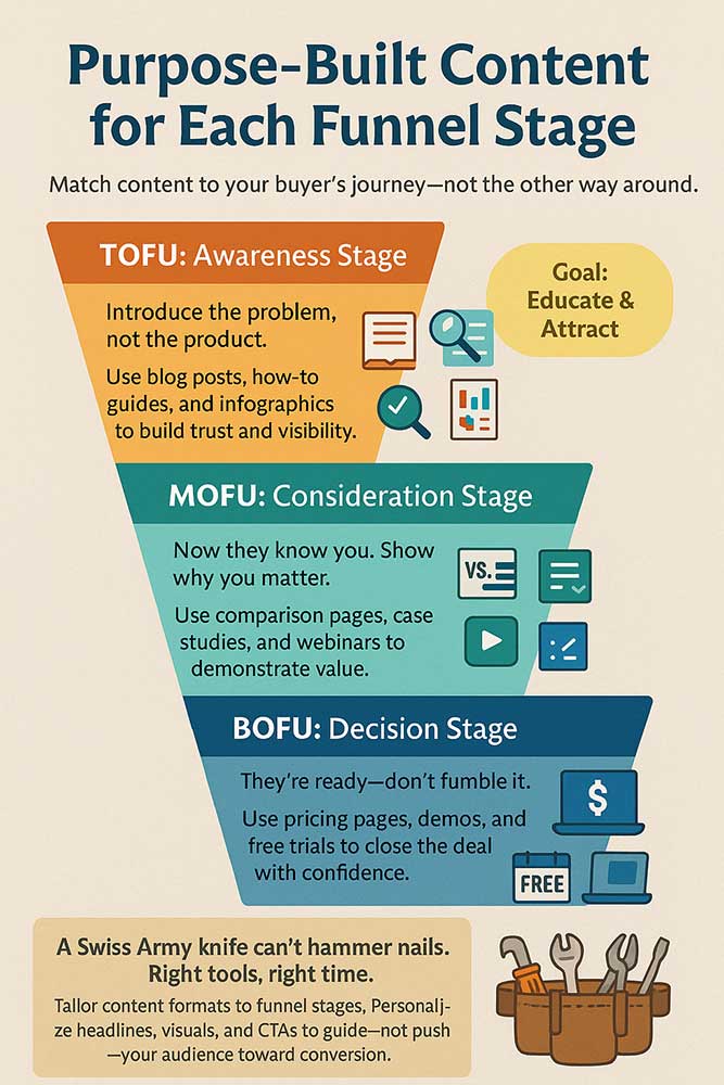
Graphic of Purpose-Built Content for Each Funnel Stage
- Bottom of Funnel (BOFU): Here’s where pricing pages, free trials, and demos come in. Decision-ready visitors need crystal‑clear next steps and assurances before opening their wallets.
By tailoring your content to each stage, you meet users where they are rather than yanking them too quickly toward a sale. It’s like offering someone the perfect tool at the precise moment—make them a power‑drill when they need a nail, not when they just asked “What is a hammer?”
Segment your calendar and map content formats to funnel stages. Then personalize headlines, visuals, and CTAs accordingly. This alignment ensures each visitor experiences a guided journey rather than a jarring sales pitch, dramatically increasing the odds they’ll stick around and convert.
Case Studies, Pricing Pages & Other High‑Intent Formats
When prospects reach for pricing details or dive into a case study, they’re signaling purchase intent louder than any click. You want to capture these signals with high‑intent content formats designed to seal the deal.
- Case Studies: Real-world stories from happy customers address doubts and showcase tangible results. Include specific metrics (“XYZ client saw a 40% boost in leads within 3 months”) and a clear call to action at the end.
- Pricing Pages: Detail tiers, what’s included, and the unique value of each plan. Use comparison tables and highlight your most popular package. Transparency builds trust—no one likes hidden fees.
- Product Comparisons: Help buyers weigh their options. Side‑by‑side feature lists and pros/cons charts guide decision‑makers who are evaluating multiple vendors.
- Testimonials & Reviews: Place them near your core CTA to reinforce credibility at the moment of truth.
These formats cater to readers who aren’t browsing—they’re evaluating, vetting, and almost ready to click “Buy.” If your case study feels generic or your pricing page is buried under marketing jargon, you’ll lose momentum. But when crafted with clarity, social proof, and frictionless design, these high‑intent pages become conversion machines, turning your web marketing strategy into a revenue engine.
Aligning Your CTAs with Buyer Mindsets
A misplaced call to action is a lost opportunity. The same CTA text that works for a fresh visitor may flop with a seasoned prospect. Align your CTAs with where people are mentally:
- For TOFU visitors, use low‑commitment CTAs like “Learn More” or “Explore the Guide.” Keep the ask simple and friction‑free.
- For MOFU users, click “Watch the Case Study” or “Download the Comparison Checklist.” These invites show deeper value and require a bit more engagement.
- For BOFU prospects, go for direct conversion CTAs: “Start My Free Trial,” “Get a Quote Now,” or “Schedule My Demo.”
Placement matters, too. Above the fold for TOFU blog posts, mid‑article for MOFU content, and right next to pricing tables or feature lists for BOFU pages. Use contrasting colors and whitespace for visibility, but avoid screaming “BUY NOW.” The tone should match the mindset—friendly nudge at the top, confident ask at the bottom.
Syncing your CTA language and placement to buyer intent removes mental friction and guides visitors naturally toward the next step. It’s like giving someone the right directions at each fork in the road—suddenly, everyone ends up where you want them.
Crafting a Content Roadmap That Converts
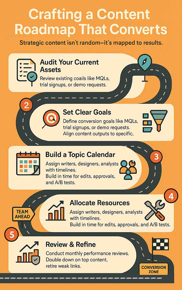
Audit Your Current Assets: List existing posts, pages, and resources. Identify gaps in funnel coverage and high‑performance champions.
Set Clear Goals: Define target metrics—monthly MQLs, trial signups, demo requests—and map them to content initiatives.
Build a Topic Calendar: For each funnel stage, assign content types (TOFU guides, MOFU webinars, BOFU case studies) to specific dates, ensuring a balanced pipeline.
Allocate Resources: Match writers, designers, and analysts to each piece—factor in time for revisions and A/B testing.
Review & Refine: Establish monthly checkpoints to measure outcomes against goals, double down on winners, and retire underperforming assets.
The graphic shows a roadmap for content that converts.
Without a roadmap, even the best content efforts can wander aimlessly. A conversion‑focused content roadmap aligns topics, formats, and timelines to your business objectives:
- Audit Your Current Assets: List existing posts, pages, and resources. Identify gaps in funnel coverage and high‑performance champions.
- Set Clear Goals: Define target metrics—monthly MQLs, trial signups, demo requests—and map them to content initiatives.
- Build a Topic Calendar: For each funnel stage, assign content types (TOFU guides, MOFU webinars, BOFU case studies) to specific dates, ensuring a balanced pipeline.
- Allocate Resources: Match writers, designers, and analysts to each piece—factor in time for revisions and A/B testing.
- Review & Refine: Establish monthly checkpoints to measure outcomes against goals, double down on winners, and retire underperforming assets.
This strategic roadmap prevents haphazard blog posts and one-off campaigns. Instead, every post contributes to a coherent narrative, smoothly moving prospects from awareness to action. It’s like taking the time to plan a road trip with pit stops, sightseeing, and a final destination rather than just hopping in the car and hoping for the best. With a clear conversion‑driven roadmap, your web marketing strategy becomes a coordinated journey that delivers predictable, compounding results.
3. Uncovering Funnel Friction: Content as Your Hidden Bottleneck
Every smooth funnel has hidden creaks. You might boast stunning visuals and slick layouts—but if your words don’t guide readers forward, conversions stall. In this section, we’ll peel back the curtain on five common content roadblocks:
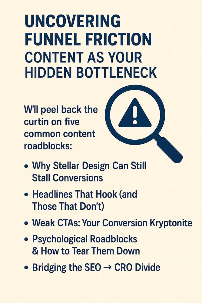
A graphic showing the Uncovering of Funnel Friction
3.1 Why Stellar Design Can Still Stall Conversions
A beautiful website feels like a gift, but nobody opens it if it is wrapped too tightly. Stunning visuals can distract if they overshadow your message or confuse readers about what to do next. Imagine a dazzling homepage with no obvious next step—visitors linger, then bounce.
Great design should guide the eye and support your words, not compete with them. White space helps highlight your most important points. Contrasting colors direct attention to key sections. Straightforward typography ensures readers can scan without squinting.
When design and copy aren’t in sync—say, a bold background that hides your headline—you create friction. Readers pause, wonder what to click, and often leave. The fix? Audit your layouts and ask: Does every graphic point to a conversion goal? If not, tone it down or reposition elements. Your B2B content that converts needs space to breathe, with design as its helpful wingman.
3.2 Headlines That Hook (and Those That Don’t)
A headline is your first—and sometimes only—shot at grabbing attention. A strong headline promises an immediate benefit or teases a compelling story. Weak headlines, by contrast, feel vague and leave readers yawning.
Effective hooks tap into the reader’s pain or desire.
Try “Struggling with Low Conversions?” instead of “Tips for Better Conversions.” The first asks a question readers are silently asking; the second feels generic.
Bad headlines often bury the benefit or hide it in jargon. If readers can’t tell what’s in it for them in three seconds, they move on. To test your headlines, use A/B split tests with live traffic—track which versions earn clicks and engagement. Over time, you’ll learn which words resonate with your audience.
Remember: headlines serve your content that converts by pulling readers deeper. Write multiple options, pick the strongest, and don’t be afraid to refine based on data.
3.3 Weak CTAs: Your Conversion Kryptonite
Your call to action is the moment readers turn intent into action. A buried, ambiguous, or generic CTA is kryptonite for conversions. “Click Here” tells readers nothing about the value they’ll get.
Strong CTAs use active verbs and convey a clear benefit: “Get My Free Playbook” or “Start My 7-Day Trial.” Placement matters too. If you hide CTAs at the bottom of a long page, many readers will never see them. Instead, sprinkle context‑driven CTAs at key points—after a benefit statement, testimonial, or proof snippet—to capture momentum.
Color contrast is crucial: your CTA button should pop but still fit your brand palette. Mobile users should tap easily, so make buttons large enough and place them within thumb reach.
By sharpening your CTAs, you transform passive readers into active participants, powering your B2B content to its fullest potential.
3.4 Psychological Roadblocks & How to Tear Them Down
Subtle mental blocks can freeze decisions even when design, headline, and CTA align. Decision paralysis sets in when readers face too many options, and cognitive overload strikes when language feels complex or dense.
Simplify choices to remove friction: offer a single, clear path instead of multiple confusing buttons. Use plain English; avoid industry jargon. Break text into bite‑sized chunks and use bullet lists to lighten the cognitive load.
Trust gaps form when readers doubt your credibility. Combat this with social proof—testimonials, trusted client logos, or security badges near the CTA. Fears of risk—“Will this help me?”—fade when you offer guarantees or free trial periods.
Address objections proactively. If customers often worry about setup time, include a line like “No installation required—get started in minutes.” By dismantling these psychological barriers, your B2B content that converts becomes an experience of smooth confidence, guiding readers to their next step.
3.5 Bridging the SEO → CRO Divide
SEO teams chase rankings; CRO teams chase clicks and conversions. Both goals matter, but siloed efforts leave a gap: excellent search visibility with low conversion rates.
Bridging this divide means writing SEO‑optimized headlines and meta tags that accurately reflect page content and conversion goals. Integrate primary keywords into benefit‑focused H1s—“Boost Conversions by 30% with Proven Tactics”—instead of generic SEO dumps.
Ensure your on‑page structure balances crawlers and customers: use H2s and H3s for scannability, internal links for authority, and persuasive copy blocks for action. Test pages that rank well but convert poorly—tweak headlines, CTAs, and page layouts to align with CRO best practices.
By marrying SEO insights with CRO techniques, you’ll unlock traffic and action—turning optimized impressions into meaningful business results.
4. The Anatomy of Persuasion: Fixing Content That Converts
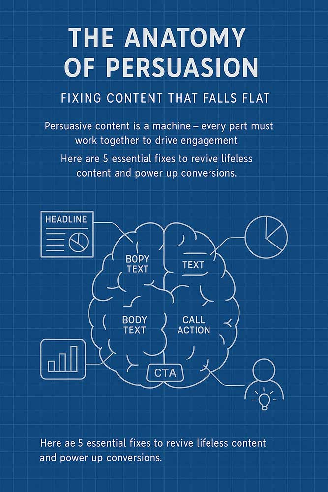
Persuasive content is a finely tuned machine—each part must work harmoniously to move the reader from passive browsing to active engagement. This section dives into five critical pillars that revive flat, lifeless copy and turn it into a conversion engine.
First, we’ll explore how pinpoint messaging speaks directly to the right audience, cutting through noise using resonating language—all part of content engagement strategies.
Graphic showing the Anatomy of Persuasion
Persuasive content is a finely tuned machine—each part must work harmoniously to move the reader from passive browsing to active engagement. This section explores five critical pillars that transform flat, lifeless copy into a conversion engine. First, we’ll explore how pinpoint messaging speaks directly to the right audience, cutting through noise using resonating language.
Then, we’ll examine CTAs that command attention, learning to build compelling calls to action with urgency, and clarity. Next, we’ll tackle reducing decision paralysis, simplifying choices, and guiding readers step by step to ensure they never feel stuck. After that, we’ll show you how to integrate SEO smarts with CRO tactics, marrying keyword-driven optimization with persuasive flow so that you rank well and convert even better. Finally, we’ll map out a unified workflow from awareness to action, weaving each piece of content together into a seamless journey that nurtures prospects at every touchpoint.
Together, these five pillars are very persuasive: a blueprint for diagnosing why your current copy falls flat and how to build it back stronger. Whether you’re updating a landing page or scripting a blog post, these strategies will help you write with precision, purpose, and power. Let’s dig into the first pillar—pinpoint messaging—and see how tailoring your language can drastically boost engagement and conversions.
4.1 Pinpoint Messaging: Stop Talking to “Everyone”

One-size-fits-all copy rarely fits anyone well. Pinpoint messaging means writing with a laser focus on a specific audience segment—using the words they type into search bars and the pain points they voice in forums. Create a detailed persona: demographic details, job role, challenges, and goals.
Graphic of a man in a crowd
Next, mine customer feedback, support tickets, and social media comments to capture their exact phrasing. Readers feel seen and understood when your headline and opening sentence mirror their internal monologue—“Struggling to convert your blog visitors into leads?”.
This approach also dictates content structure: speak first to their most urgent problem, then guide them through a narrative that addresses objections step by step. Avoid generic buzzwords; opt for concrete language that conveys real value. For example, instead of saying “Improve your workflow,” say “Save 2 hours per week by automating manual tasks.”
That specificity separates you from generic competitors and signals that you grasp your audience’s unique needs. In essence, pinpoint messaging transforms your content that converts by turning broad appeals into custom-fit solutions.
Are you interested in maximizing your online growth? We can help you with Web Design, SEO, AI, and Content Writing. Talk to Us! Call: (857)400-8959
4.2 CTAs That Command Attention
A call to action is the tipping point between engagement and drop-off. To command attention, CTAs must blend persuasive copy, design contrast, and strategic placement. Use strong, action-oriented verbs—“Claim,” “Download,” “Start”—paired with clear benefits: “Claim Your Free Conversion Checklist.” Incorporate urgency or scarcity—“Only 5 Spots Left”—to spark immediate clicks.
Design-wise, CTAs should pop visually: choose a color that stands out against your page palette and surround the button with whitespace to avoid clutter. Position primary CTAs above the fold for high-intent visitors, mid-content after key value propositions, and below the fold for those who scroll.
Mix in subtle secondary CTAs—like text links—for readers who aren’t ready for the main ask but want a softer engagement, such as “Learn More About Our Approach.”
Finally, test variations of copy, color, and size regularly. A/B test headlines (“Get My Free Guide” vs. “Download the Ultimate Guide”) and button shapes to see what resonates. By creating CTAs that grab the eye and spell out the benefit, you turn passive readers into active participants in your content that converts journey.
4.3 Reducing Decision Paralysis with Clarity
Too many options can freeze decision-making, a phenomenon known as decision paralysis. To combat this, streamline choices and simplify your page. Offer a single primary action—like “Start My Trial”—and limit secondary options to one or two apparent alternatives. Use numbered steps or bullet lists to break down processes: “1. Enter your email. 2. Choose a plan. 3. Confirm payment.” This step-by-step guide reduces cognitive load and guides readers forward logically.
Language matters, too: replace multi-clause sentences with concise, active-voice statements. Headlines like “Choose Your Plan” or “See Your Savings” give readers a crystal-clear understanding of what to expect. Eliminate jargon and unnecessary verbiage; every word should serve a purpose. For forms, ask only for essential fields to reduce friction; consider progressive profiling for deeper data collection later.
Visual cues—such as arrows pointing to buttons or progress bars showing completion—help readers feel in control. By removing complexity and presenting a clear, singular path, you reduce decision paralysis and smooth the way for conversions. The result: your content that converts feels like a guided tour rather than a maze.
4.4 Integrating SEO Smarts with CRO Tactics
SEO and CRO share the same goal of driving valuable visitors—but too often, they work in isolation. Integrating SEO smarts with CRO tactics means writing copy that ranks well and persuades effectively.
Start by selecting primary and secondary keywords that align with user intent, then weave them naturally into benefit-driven headlines and subheads. For instance, instead of “Best Conversion Tools 2025,” try “Boost Conversions by 30% with These Tested Tools.”
Optimize meta titles and descriptions to include your target keyword while previewing the benefit. Use clear H2s to organize content for crawlers and readers on the page and include internal links to high-converting pages (pricing, demos, case studies). Ensure your page loads quickly and is mobile-friendly—factors affecting search ranking and user retention.
Next, align SEO-driven elements—like keyword density and schema markup—with CRO best practices: prominent CTAs, social proof, and concise copy blocks. Use A/B testing to find the optimal headline copy that satisfies SEO and conversion metrics. By blending these disciplines, your content that converts will attract the right traffic and turn it into meaningful action.
4.5 From Awareness to Action: A Unified Workflow
Conversions don’t happen in a vacuum—they unfold over multiple touchpoints. A unified workflow stitches together awareness (TOFU), consideration (MOFU), and decision (BOFU) content so each step naturally leads to the next. Map your buyer’s journey: an educational blog post (TOFU) links to a detailed case study (MOFU), which then funnels into a demo request page (BOFU).
Automate handoffs with email sequences triggered by user behavior. For example, after a visitor reads your TOFU (top of funnel) guide, send a follow-up email with a related MOFU (middle of funnel) resource. Remarketing ads can recapture users who drop off at the MOFU stage, reminding them of the MOFU content they viewed. Ensure every CTA along the path reflects the stage’s mindset—from “Learn More” to “See It in Action” to “Book a Demo.”
You guide prospects from first encounter to final conversion without abrupt jumps by orchestrating content in a seamless, data-driven workflow. This cohesive approach transforms scattered content into a well-oiled content that converts the engine, driving sustained growth and measurable results.
5. Personalization Power Plays for Next‑Level Conversions
Nothing says “you” like content that changes just for you. AI supercharges personalization by treating visitors as VIPs, serving messages tuned to their behavior and needs. In this section, we’ll unpack five game-changing tactics for content engagement strategies:

Tailored Experiences vs. Generic Blasts explains why one-to-one messaging outperforms mass emails.
Behavioral, Demographic & Firmographic Targeting dives into the three data-driven layers you can leverage.
Real-Time Personalization: Right Message, Right Moment shows how to swap headlines or offers instantly based on live signals.
Measuring the Lift from Personal Touches covers metrics and tests to quantify your personalization gains.
Putting It All Together: Personas in Action results in a cohesive strategy.
Graphic of Real-Time Personalization
Together, these four actions play a role in shifting your web marketing strategy.
Tailored Experiences vs. Generic Blasts
This is nice, you walk into your favorite coffee shop and hear the barista greet you by name with your usual order ready. That’s the magic of tailored experiences. Generic blasts, on the other hand, feel like mass mail—easy to ignore.
AI tools analyze browsing history, past purchases, and referral sources to deliver content that feels custom-crafted.
Lets say your a first-time visitor from a blog post might see an email offering a free guide, while a returning buyer gets an invite to a loyalty discount.
Making these experiences different, you show you understand each individual’s journey, increasing both trust and conversions.
In your web marketing strategy, scaling personalized messaging thanks to AI means more meaningful interactions and fewer people falling through the cracks.
We remember when it was easy to rank on Google. Times change, are you interested in maximizing your online growth? We can help you with Web Design, SEO, and Content Writing. Talk to Us! Call: (857)400-8959
Behavioral, Demographic & Firmographic Targeting
Personalization thrives on data. AI uses three primary signals:
- Behavioral: Actions like page views, time on site, or cart abandonment.
- Demographic: Age, location, language, or device type.
- Firmographic (B2B): Company size, industry, revenue—often via IP lookup.
Behavioral data lets you trigger real-time offers (“You left these items in your cart—ready to complete?”). Demographic tweaks adapt your message for local events or languages.
Firmographic targeting tailors B2B case studies to match specific industries (“How healthcare teams optimize with X”). Merging these layers creates hyper-relevant messaging that accelerates conversions in any web marketing strategy.
Real-Time Personalization
Static pages serve duplicate content to everyone, but your visitors are anything but identical. Real-time personalization uses live data—UTM tags, referrer, and geolocation—to swap page elements on the fly.
A visitor clicking from a paid ad sees a matching headline and CTA; an email clicker on a product page instantly sees a price discount pop-up.
Implement real-time personalization with a lightweight script or plugin. Define rules like “if UTM source=‘newsletter’ show banner A, else show banner B.” Test variants to find the highest-converting combinations. When done right, real-time tweaks feel invisible to users yet significantly boost engagement and action across your web marketing strategy.
Measuring the Lift from Personal Touches
To prove personalization’s power, track key metrics. Use A/B or multivariate testing: show a static version to a control group and a personalized version to test users. Compare conversion rates, average order values, and engagement time.
Set up tracking in your analytics platform—tag personalized segments and monitor revenue-per-user. Look for lifts of 10–20% as initial wins. Over time, refine your models based on success patterns. Document each experiment in a living dashboard so your team sees which personalization tactics drive the most ROI.
Putting It All Together: Personas in Action
Personas are the glue that bonds these tactics into a unified plan. Start by defining 3–5 core personas—each with goals, pain points, and preferred channels. Map out the ideal content journey for each: which emails, blog posts, and ads they see and when.
Feed these journeys into your AI platform: assign persona tags, trigger content rules, and automate follow-up sequences. Monitor performance by persona to spot which needs more nurturing. By operationalizing personas, you turn data into stories—ensuring every user feels recognized, engaged, and inspired to convert across your web marketing strategy.
6. Blueprint for High‑Converting Content Engagement and Page Structure
The structure of your page can be the difference between a glance and a sale. In this section, we’ll unpack five critical elements that work together to guide visitors from first look to final click:
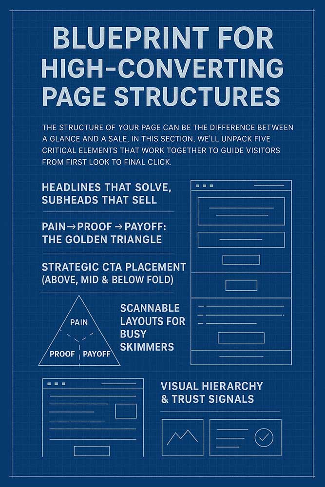
Blueprint for High-Converting Page Structures
- Headlines That Solve, Subheads That Sell shows how to craft headings that immediately promise value and support them with subheads that reinforce the benefit.
- Pain → Proof → Payoff: The Golden Triangle explains the three-part formula to empathize with visitor problems, demonstrate real results, and lay out the end benefit.
- Strategic CTA Placement (Above, Mid & Below Fold) dives into positioning your calls to action exactly where momentum is highest.
- Scannable Layouts for Busy Skimmers covers breaking content into digestible chunks—bullets, bold text, and clear sections—for rapid comprehension.
- Visual Hierarchy & Trust Signals
Design isn’t just decoration; it’s a roadmap for the eye. Use size, color, and placement to establish a visual hierarchy—headings larger and bolder than subheads, CTAs in contrasting hues, and key benefits highlighted in callouts. Pair these with trust signals: client logos, security badges, testimonials with photos, and real‑time statistics (“100+ companies served”).
These credibility markers reassure visitors at critical moments, reducing anxiety and boosting confidence. When visual hierarchy and trust signals work in harmony, your content that converts feels not only compelling but also entirely safe to act on.
Are you interested in maximizing your online growth? We can help you with Web Design, SEO, AI, and Content Writing. Talk to Us! Call: (857)400-8959
7. Content Formats That Move the Needle
Not all content wears a cape—but certain formats pack a heroic punch. In this section, we’ll spotlight five go-to formats that reliably drive conversions:
- Landing Pages Built to Convert breaks down the anatomy of single-purpose pages that funnel visitors straight to your goal.
- Comparison & Solution Pages for Informed Buyers shows how side‑by‑side comparisons and targeted solution pages ease decision-making.
- Pillar Pages as Conversion Magnets explores long-form guides that establish authority while guiding readers into your funnel.
- Case Studies & Social Proof That Seal Deals highlights real-world stories and testimonials that overcome objections.
- Micro‑Content & Interactive Elements dives into quizzes, calculators, and micro-videos that boost engagement.
These formats each have unique strengths, and when used strategically, they become powerful levers in your content that convert machines. Let’s break down how to wield each one.
Landing Pages Built to Convert
Landing pages are the superheroes of conversion—single-minded, action-focused, and unburdened by site navigation. A stellar landing page starts with a crisp headline, explains benefits in bullet points, showcases social proof, and ends with a bold CTA. Remove distractions—minimal or no header/footer links—so visitors funnel straight to your goal.
Structure tip: use the Golden Triangle (Pain → Proof → Payoff), sprinkle dynamic personalization for repeat visitors, and run A/B tests on headlines and CTAs. Landing pages can lift conversion rates by 20–50%, proving they’re a cornerstone of any content that converts strategy.
Comparison & Solution Pages for Informed Buyers
When prospects weigh options, side-by-side comparison pages shine. Layout feature tables that contrast your offering against competitors, highlight unique benefits with icons, and include trust signals near the bottom. On the other hand, solution pages focus on one specific use case—”How Retail Teams Use Our Tool to Boost AOV by 30%”—and walk through a tailored roadmap.
These pages serve informed buyers in the consideration stage with targeted content that addresses specific questions. By reducing friction and clarifying value, they guide visitors toward the final CTA—”Get My Personalized Quote.” For your content that converts, these formats turn comparison shoppers into confident customers.
Pillar Pages as Conversion Magnets
Pillar pages are authoritative, in-depth guides that cover a broad topic—”The Ultimate Guide to Conversion Rate Optimization.” They attract TOFU traffic via SEO and funnel readers into MOFU content like case studies or webinars embedded within the page. Use jump-to menus, summary boxes, and in-line CTAs to guide readers down logical paths.
Pillar pages build trust and keep readers on your domain longer—often exceeding five minutes in dwell time. They’re SEO powerhouses and excellent lead-gen tools paired with sticky content offers (e‑books, cheat sheets). By positioning your brand as a thought leader, you supercharge your content that converts from awareness to qualified leads.
Case Studies & Social Proof That Seal Deals
Nothing convinces like social proof. Case studies spotlight real customers and quantifiable results and often include quotes, screenshots, and video testimonials. Structure them as mini-stories: the challenge, the solution (your product), and the outcome (impressive metrics).
Embed CTAs after the payoff section—”Ready for your success story?”—to channel momentum. Case studies alleviate risk by showing prospects exactly how others achieved results. Paired with logos and review snippets, they form a conversion safety net you can’t ignore.
Micro‑Content & Interactive Elements
Micro-content—short, snackable pieces like mini-videos, GIFs, and infographics—captures attention in seconds. Interactive tools—quizzes, calculators, and assessments—engage visitors and deliver personalized results. For example, a conversion calculator that shows “Estimate Your Revenue Increase” directly ties content to value.
When you integrate micro-content and interactive features, your content that converts shifts from static pages into dynamic experiences that captivate and convert.
8. Write, Test, Tweak: Your Continuous Conversion Engine
Conversion is not a one-time project but an ongoing lab experiment. This final section covers five steps to keep your content that converts machine running smoothly:
- Audience‑First Research Before You Write ensures each piece is rooted in real user needs and language.
- Aligning Content to TOFU/MOFU/BOFU Needs matches formats and messages to visitor intent.
- Headlines & Hooks: A/B Testing Best Practices amplifies winning variants and discards underperformers.
- Sentence‑Level Precision: Every Word Counts keeps copy lean, active, and persuasive.
- Experimentation Frameworks & Data‑Driven Iteration provides a structured loop for testing, measuring, and refining.
With this engine in place, you’ll not only launch high-converting content but evolve it relentlessly—turning every update into a chance to lift performance. Let’s dive into these final steps.
Audience‑First Research Before You Write
Start with empathy. Conduct user surveys and interviews and analyze top-converting customer journeys to uncover real motivations. Use these insights to craft headlines, subheads, and CTAs that speak directly to visitor pain points, ensuring your content engagement strategies are always relevant and resonant.
Aligning Content to TOFU/MOFU/BOFU Needs
Match each content type—blog post, case study, pricing page—to its appropriate funnel stage. Use TOFU for awareness, MOFU for consideration, and BOFU for decision. This alignment removes friction and naturally guides visitors toward conversion, whether signing up, requesting a demo, or purchasing.
Headlines & Hooks: A/B Testing Best Practices
Run A/B tests on multiple headline versions using small traffic splits. Track click-through and engagement metrics to identify high performers. Rotate new hooks bi-weekly and scrap ones that underperform. By systematically testing, you ensure that your content that converts keeps improving and is backed by real data.
Sentence‑Level Precision: Every Word Counts
Edit ruthlessly. Swap passive constructions for active voice. Replace adjectives with strong verbs. Keep sentences under 20 words on average. Use bullets for lists and bold key phrases. This lean approach enhances readability and persuasion, making every line in your content that converts earn its place.
Experimentation Frameworks & Data‑Driven Iteration
Adopt a structured framework: Plan hypotheses, implement tests, review results, optimize based on findings, and continue with the following experiments (PIROC). Documentation and dashboards ensure your team learns quickly and scales successes. Continuous iteration transforms your site into a living lab, where content that converts evolves with audience needs.
Are you interested in maximizing your online growth? We can help you with Web Design, SEO, AI, and Content Writing. Talk to Us! Call: (857)400-8959
Conclusion
In today’s crowded digital marketplace, creating content is easy—making content that converts is the real challenge, which is the idea behind Content engagement strategies. You’ve learned to define conversion‑driven content, move beyond vanity metrics, eliminate funnel friction, and build persuasive structures. You’ve discovered high-impact formats, personalization power plays, and the importance of continuous testing. Now, equip yourself with this blueprint and watch your metrics transform: higher CTRs, increased AOV, and—most importantly—more customers.
Your website is not a brochure; it’s a living sales engine. Treat your content as a strategic asset—plan, personalize, test, and refine it. Do that, and every visitor becomes an opportunity, every click a step toward growth. Here’s to content that truly converts.
Stay connected
We’re always hard at work putting out new content covering WordPress, marketing, and SEO news. Stay connected with us 100% spam FREE.
We hope that you enjoy our content. If you decide to make a purchase after clicking on one of our affiliate links, we’ll earn a small commission at no extra cost to you. Thanks for reading! View our Affiliate Disclosure