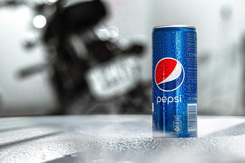
Over the past 6 months, I have noticed an increasing Growing Design Trend In Advertising Kinetic Typography for both print and television ads.
This is not new. It’s been around for quite some time.
Lately, though, a growing number of companies are joining this trend, and after this blog post, I hope you will be more aware of it and recognize it as you go about your life. The trend is minimalist and kinetic typography.
Pepsi
The first example I noticed was from Pepsi. They launched their “Refresh Everything” campaign, the first major advertising campaign with their newly redesigned logo. Back in 2009, they used the Presidential Inauguration as a vehicle to get their message out. They launched their campaign and put it EVERYWHERE, replacing all ‘O’s with the new Pepsi logo.
As a reminder, Kinetic typography is defined as moving text, an animation technique giving motion to fonts.
This is a Pepsi television spot from 2012 titled Come Alive.
Ford Motor Company
The trend has now filtered into the automotive industry, with Ford Motor Company using it for their F-150 commercials. There have been several so far, and they seem to be sticking to the style.
Nike
A 2D kinetic typography animation from a Nike ad.
Planet Fitness
Starting the 1st of the year, Planet Fitness launched a campaign similar to Ford’s. Upon further research, I discovered they had used kinetic typography for almost a year.
Starbucks
Starbucks joined Pepsi in encouraging people to vote by offering them a free cup of coffee if they voted in the 2008 election. A perfect example of kinetic typography usage in an ad.
Charlie Moore: The Mad Fisherman
Even local area stations have started employing the trend in ads. Mad Fish is a show on NESN, New England Sports Network, featuring Charlie Moore. Recently they have launched an ad featuring the same kinetic typography style as the Ford commercials. I also could not find any clips of this online.
Zombieland
Another example I noticed was in the film Zombieland. Throughout the film, viewers are reminded of Zombieland’s basic survival rules by typography creatively placed and animated within the scene.
These are just a few I have noticed. I am sure there are many more. Don’t be scared; share yours, and share your thoughts!
So there you have it. Growing Design Trend In Advertising Kinetic Typography is one of the most used types of animation. The purpose is to grab the viewer’s attention-drawing them into the message.
Adding a voice-over and some great music brings the ad to life. Thereby making it much more memorable.
Kinetic typography animation can also be a compelling video type for those who want to take a minimalistic approach to explaining a product or service.
Do you have a web project you want to discuss with our team?
We would love to hear from you! Contact Us.


Way cool! What a classic post. I really found such type of article for a long time and finally, I see it on your website. Your Website is very classic and I will definitely come back.
Thanks.