Case Study
See how we've helped transform the Portsmouth Historical Society website from an outdated design to a new upscale, colorful, easy-to-navigate website, including a quicker call-to-action conversion on the homepage.
Why The Portsmouth Historical Society Chose Us to design their WordPress Website
Craig Clark contacted us after a Google search and asked us to submit a proposal. We did, along with a half dozen other Web Agencies. After an extensive review and several interviews, they chose us to build their website and to work with them monthly for ongoing maintenance. Here are a just a few reasons why:
- Our knowledge of Historical Societies, and Museums websites.
- A team knowledgeable in WordPress design & development
- Our ability to improve the User Experience (UX) on their website
- Ranking online, SEO and page optimization
- Copy & Content curation
There was no doubt that Slocum Studio would be the right team. Our team has years of WordPress experience. We've helped hundreds of companies start and maintain their online ventures since 2007.
New Homepage Design
Our Process
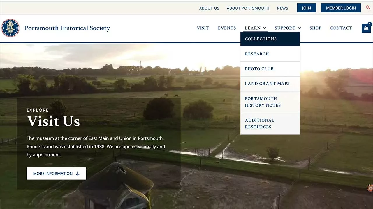
- Dual menu's for better user functionality
- Shopping page
- Member and join portals
- Video Background
Our Process
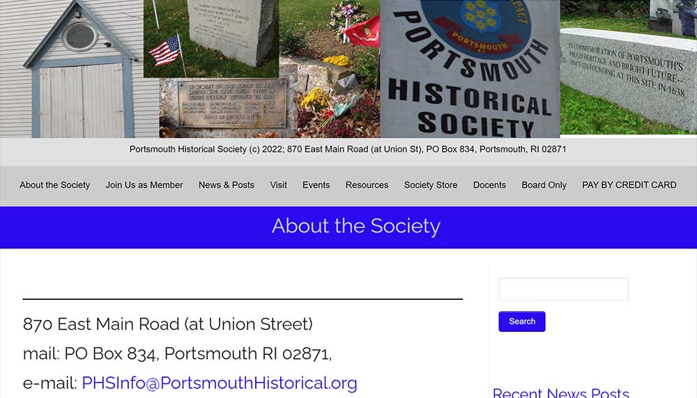
Old Homepage Design
The Society wanted a completely new look. Their website was very dated, and the homepage needed to be more organized and not filled with text. The navigation could have been more convenient and user-friendly, with important pages identified with page banners.
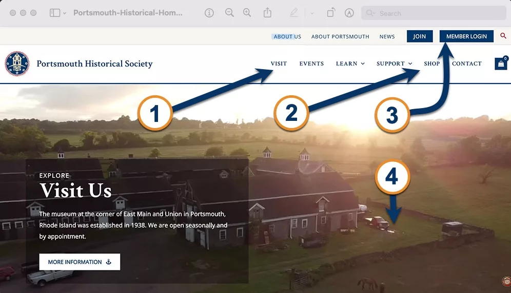
Dual Menus
Solution
Navigating the old Society menu was a hunt-and-seek process. As you can see, JOIN and MEMBERSHIP LOGIN are on top and easy to find in the new design.
With a dual menu, you see your information without navigating through separate layers of the menu hierarchy!
"Click" image to enlarge >>>
Our Process
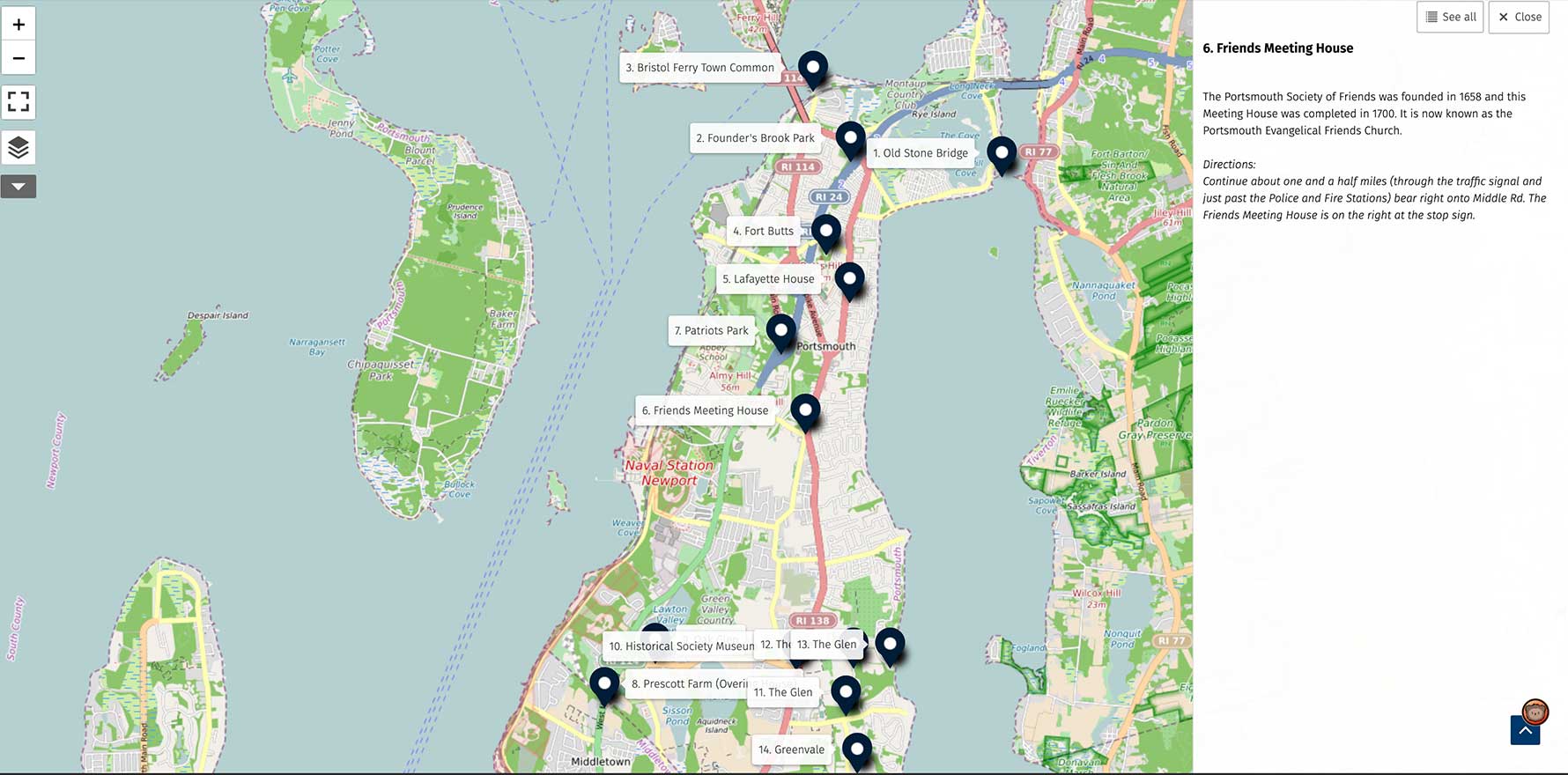
Car Tour
When you "click" on a pin, the directions show in the right column. There are both driving and walking directions on the website. This is a great feature, especially in a tourist location or for a family or group that wants to plan their activities for the day!
Solution
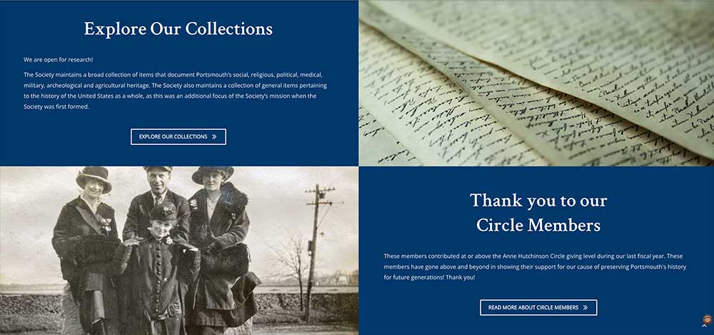
Descriptive Text & Image Blocks
Use of brand colors and fonts
These images span edge to edge on the homepage. The color blocks and text are easy to read, while the image supports the captions.
There is also a call to action button should the viewer want to read more.
Solution
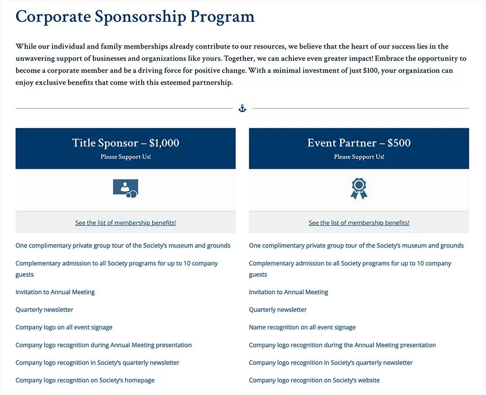
"Sponsorships and donations fuel nonprofits."
Clear and informative text provides essential details about corporate sponsorships and donations, helping potential supporters understand the significance of their contributions.
Additionally, high-quality graphics can visually represent the non-profit's mission, goals, and the positive outcomes of donations. They can evoke emotions and connect the visitor and the organization's mission.
Solution
Whats in a footer?
More information for better UX
- "Clickable" contact information
- Support & Join options
- Footer menu
- Newsletter sign up
The Portsmouth Society's previous footer did little to inform the user and did not allow them access to important information easily.

The Results
The Portsmouth Historical Society now has a new website. Just one month after launch, visits to the website have increased along with membership signups and donations. They also have a functional e-commerce store.
The website is much more user-friendly and intuitive. People have commented on how great the site looks. We’re sure when the tourist season starts next spring (2024); the Society will see a significant increase in visits and time on page.
We’re excited and wish them much success!
Looking for similar results with your project?
We can help you succeed in your online ventures. We'll study your goals and create a plan with solutions to effectively meet and exceed them!
or call
(857) 400-8959

