You don’t have much time to make a great first impression with your website and get your visitors to stay.
People form an opinion about a site in 50 milliseconds, which means that if they don’t like what they see, they’ll bounce off in a snap and go to your competitors.
Besides the obvious loss of potential customers or subscribers, such a poor dwell time can additionally hurt your business. It’s a signal to Google that searchers didn’t find your site relevant or valuable, prompting the search engine to lower your ranking.
So, no matter how exceptional your content is or how good your products are, your conversion rates will suffer if you fail to wow your visitors instantly with the design of your website.
Let’s discuss how to fix six common design mistakes that can ultimately affect your site’s conversion rate.
1. Bad UX Results in Abandoned Carts
The average cart abandonment rate is almost 70%.
This means that only 30% of those who add items to their shopping cart actually finalize transactions.
Even though, according to surveys, a significant number of these indecisive customers say that they simply aren’t ready to buy, there are other reasons why people initiate the checkout process but fail to complete the purchase.
And many of them have a lot to do with website design.
Here are some of the biggest UX-related complaints that lead to shopping cart abandonment.
Forcing customers to create an account
Having an account is a great way to speed up the checkout process and encourage repeat purchases.
But, let’s be honest – it’s not like your customers will be thrilled with the idea of having to create an account so that they can purchase the product they have already put in their cart. It’s more likely they will roll their eyes and leave. You can’t blame them because nobody is fond of paperwork, right?
In other words, in their opinion, this requirement is a buzzkill and a barrier to a seamless shipping experience.
Many Mornings solved this by allowing a hassle-free guest checkout. They do have the option to create an account so that customers have a choice.
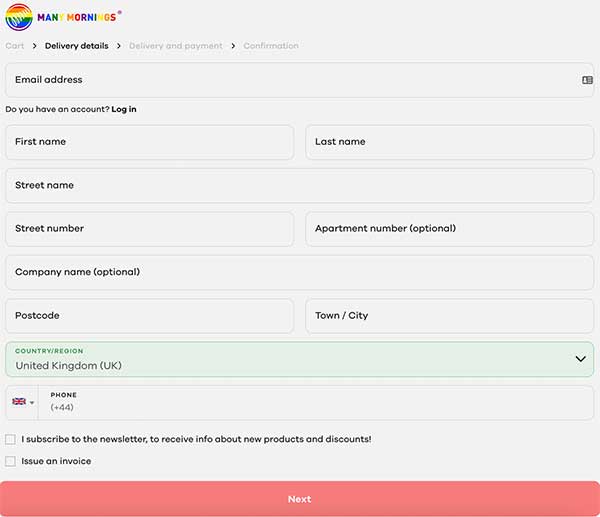
However, you can rethink your timing and suggest your customers create an account after they have completed the checkout and while they’re still happy and excited about the purchase they made
Unexpected costs
Nobody likes unpleasant surprises, and that’s exactly how customers feel when they find out that they have to cover a hefty shipping fee.
This lack of transparency can erode their trust in your business, even though your idea isn’t to trick them into ordering a product by hiding the shipping costs. Sometimes it’s difficult to calculate how much the shipping will be before the customer enters their exact address.
The best solution?
Offer free shipping, if possible. If that’s not an option, consider determining a universal delivery charge and including it in the product price. By doing so, your customers won’t perceive that they have to pay an additional cost, and offering free shopping looks like an excellent deal.
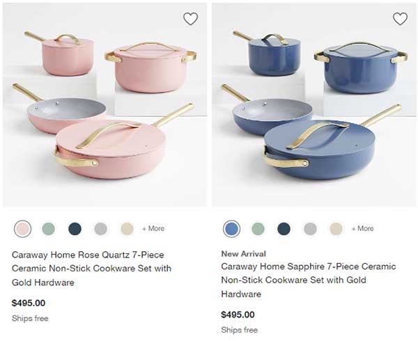
Crate&Barrel products come with free shipping, as you can see on their Caraway product page, and the store highlights this perk even while the customers are just browsing.
The shopping cart isn’t prominent enough
Sometimes customers put products in their shopping cart but want to continue browsing.
That’s good because they might find another item they will purchase. But if they’re not reminded that they already have products in the cart, they might get carried away and forget about that.
To avoid this mistake, it’s crucial to make your shopping cart prominent and urge your customers to finalize their purchases.
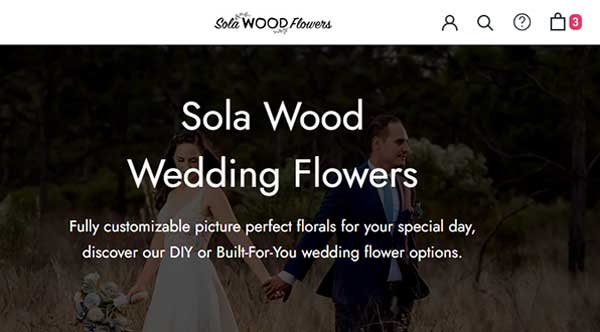
Sola Wood Flowers is a good example to check out. Their Sola Wood Weddings Flowers page shows the number of products in red when customers are away from the products/shopping section of the site but have items in the cart. Hovering over the element shows a great view of the cart contents.
Need help with your e-commerce website? Call Us: 857-400-8959
2. Unnecessary Product Navigation
Regardless of what you want to achieve – sell something, get people to subscribe to your newsletter, or click on your ads, it’s crucial to keep things simple.
You don’t want to confuse your website visitors by offering them a zillion possibilities.
While it’s true that people want more options, inundating your website visitors with choices can have the opposite effect. The phenomenon called “choice overload” can hurt your conversion rate just as much as the lack of choice.
Research from 2018 showed that 42% of people abandoned a planned purchase because they were faced with too many choices.
According to another study from 2000, 30% of people purchased jam when they had six options, while only 3% managed to make a decision when given 24 different options.
Long story short, to help your customers take action or purchase, try reducing the number of clicks it takes them to get items into their cart or convert.
Consider using your home/landing page to trigger the purchase; that way, you’ll get straight to the point.
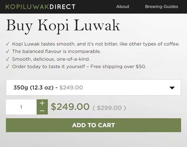
For example, Kopi Luwak Direct doesn’t even have a product page. The homepage has everything that shoppers need to get items into their carts. This kind of simplicity is powerful and allows customers to focus on the product and complete the transaction.
3. Insufficient Social Proof
92% of customers are more likely to trust recommendations from other people, even if they don’t personally know them, as opposed to brand messaging and paid ads.
But you can’t put a couple of user reviews on your website and expect to build trust with your potential customers.
Not having enough social proof can lead to suspicion, especially if your product is somewhat unusual or unique. Some products just need extra evidence to urge shoppers that it’s not a scam. Social proof is always important, but for some products, it’s absolutely vital.
Using several types of social proof can lend credibility to your brand and convince customers that you’re legit and trustworthy.
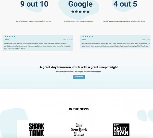
For example, Somnifix is a very unusual product that caters to a specific target audience with a particular pain point. Hyper-skeptical members of their target audience may even worry about whether the product is a scam or not. So, the designers have focused heavily on social proof to show that the brand is trusted and reliable.
Their website features plenty of social proof, including aggregated star ratings, specialist endorsement, detailed customer reviews, and earned media logos. This way, potential customers can rest assured that the product they purchase isn’t a quack medicine but an effective and helpful solution for their sleep problems.
4. Incentives Aren’t Showcased
Growing your subscriber list is a must if you want to boost your conversions. More subscribers translate to more business opportunities.
But, getting people to sign up for your newsletter or email list is challenging, especially now that anti-spam laws are harsh and uncompromising when it comes to preventing unsolicited email messages.
While you can politely ask people who land on your website to enter their email addresses and sign up for your newsletter, you won’t have much success unless you give them something in return.
Offering a discount, coupon, free trial, phone consultation, ebook, or industry report can do wonders for your sign-ups. People love free stuff, and by throwing in a little something, you’ll make them feel like they’re getting added value.
But all this is in vain if you don’t catch your visitors’ attention and if your offer is tucked away somewhere at the bottom of your homepage where nobody can see it.
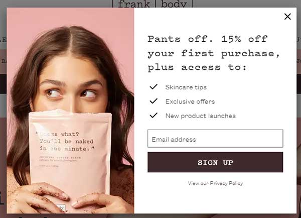
Frank body, a clean and cruelty-free skincare brand, visibly showcases incentives for joining their email list and referral above the fold on their homepage. By placing this offer so prominently, the brand offers a clear benefit and makes it visible.
5. CTAs That Aren’t Engaging Enough
Calls to action are among the most important elements of your website.
But you can royally mess things up if your CTAs aren’t engaging enough.
Here are some best practices to follow if you want to get your website visitors to click and convert.
- Make your CTAs visible. It’s crucial to place your main CTAs above the fold if visitors don’t scroll down. Also, ensure they’re large and conspicuous to grab as many eyeballs as possible.
- Use actionable text. It’s best to leverage action words and create urgency. For example, Buy Now, Improve Your Skin, Subscribe to Our Newsletter, Save Your Seat, or Get Your Coupon.
- Pick a complementary color. To make your CTA stand out, use a color complementary to the page background.
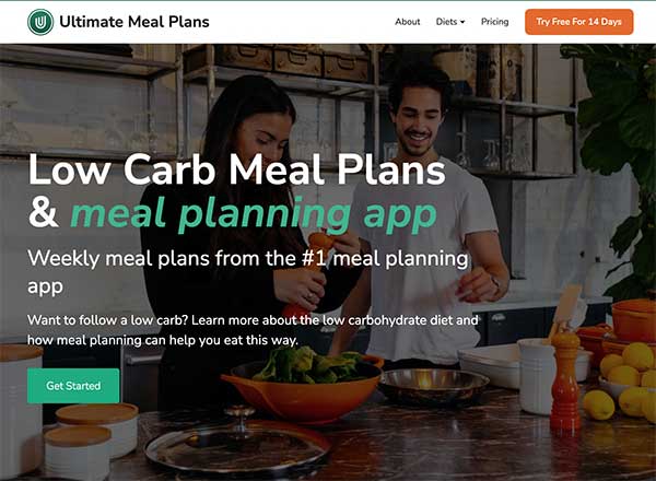
Ultimate Meal Plans, as you can see on their low carb meal plans page, implemented all these simple guidelines and came up with compelling and engaging CTAs that their website visitors can’t help but click on.
6. Forcing Users to Engage With Too Much Content
Yes, content is king and stuff, but this corny phrase does make sense.
Visitors come to your site to find solutions to their problems, learn something, or be entertained; that wouldn’t be possible without content.
But there’s this tiny detail you should be aware of: people don’t read online.
At least they don’t read as you’d expect them to, word by word or sentence by sentence. Instead of this traditional approach to reading, 79% of readers take shortcuts by scanning a piece of content and identifying the words and sentences of interest to them.
So, break down those walls of text as they’re generally very difficult to engage with. If your conversion page is content-heavy, ensure it’s highly readable online.
Looking to grow your brand online?

Use chunking
This tactic refers to splitting long paragraphs into smaller segments that are easier to follow and digest.
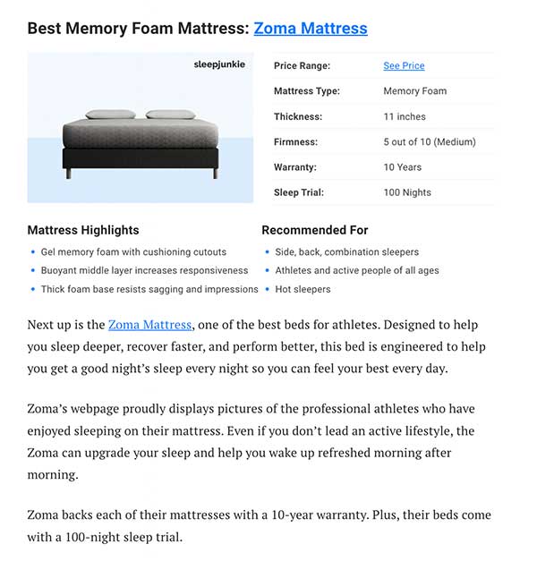
Implement bullet points, lots of images, and short sections to create readable, bite-sized chunks of text that are easier on the eyes. That’s how your visitors won’t have trouble finding exactly the information they’re looking for.
For example, Sleep Junkie does this in their best mattress post, thus allowing their customers to skim the content and quickly find what they’re looking for.
Use skip links
Don’t make your readers go through the entire article to find the section they’re interested in.
It’s a much better solution to implement skip links and allow them to jump directly to the part that applies to them.
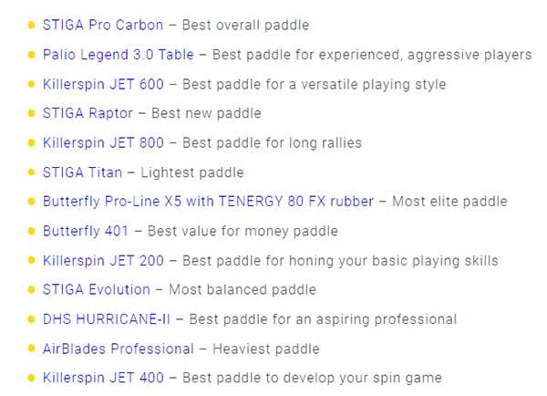
For example, Above House, in their best ping pong paddles post, improves the readability of the content by summing it up into a couple of jump-to-a-section links. These are conveniently placed at the beginning of each post so readers can easily navigate to the sections that are relevant to them.
In Closing: Boost Conversion Rates with Good Design
Fixing these six design mistakes can go a long way toward improving your conversion rate. What’s even better, all these fixes are easy to implement and don’t require a complete redesign of your pages. They’re low-hanging fruit, as by making these tweaks, you’ll automatically improve the UX of your website and make it more appealing to your audience.
Need help with your WordPress website? Call Us: 857-400-8959


