
There are almost 1.9 billion sites on the internet, and saying that it’s challenging to stand out among them would be an understatement. Especially if we bear in mind that this abundance allows people to be picky when it comes to websites they want to interact with.
That brings us to the most important factor influencing your visitors’ perception of your website – visual appeal.
A survey found that 94% of participants’ feedback about website credibility was design-related. In other words, only 6% of the feedback was about the content itself. So, it’s easy to conclude that if you want to boost your engagement and conversion rates, your website has to be designed well.
Here’s how you can utilize the power of website visuals to turn site visitors into customers.
1. Ensure Visual Consistency
People aren’t aware of a huge portion of what they perceive through their senses. To be more precise, we consciously process a minuscule 0.7% of what we see, touch, hear, smell, or taste. And given that we heavily rely on our sight when interacting with websites, it’s safe to conclude that visual design works on a deeply subconscious level.
That’s one of the reasons why it takes people only 50 milliseconds to form an opinion about whether they like your website or not.
Familiarity plays an important role in capturing your visitors’ attention and getting them to stay longer, engage, and finally convert. If your website is visually consistent, users can navigate it more easily, which makes them feel more comfortable.
To achieve such a well-designed visual flow and coherence, focus on the following elements.
Typography
It’s ok to use different fonts and styles, but don’t get carried away.
Diversify between different text categories, but stick to the same typeface, size, and style for each of them. For example, all your H2 subheadings should follow the same pattern and be consistent in terms of the typeface and font size.
The same applies to formatting and line spacing, as that’s how you’ll improve readability.
Imagery
Images, illustrations, and graphics on your site should have the same look and style.
In addition to that, creating custom illustrations will reinforce your branding and help you stay top of mind with your website visitors.
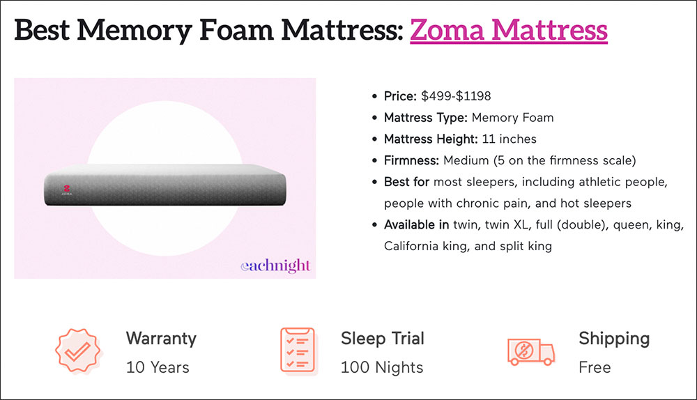
Eachnight uses a mellow color palette and custom illustrations to achieve visual consistency. All designs align with the website’s main theme – sleep health and getting a good night’s rest.
Functional Consistency
Intuitive navigation makes all the difference in UX design.
With functional consistency, your visitors will be able to browse through your site easily. For example, the top-left position is the most typical place where visitors expect to find your logo. Acting on this predictability will improve your site’s usability.
Another example is linking your logo to the homepage. This way, visitors can easily find their way back in case they get lost in the depths of your website.
Are you looking to grow your brand online?
2. Don’t Hesitate to Use White Space
Too much clutter on a website can be overwhelming and hard on the eyes. As a result, readability drops, together with your dwell time and conversion rates.
Not every single inch of your web page has to be packed with content, visuals, and fillers.
Quite the opposite, it’s much better to give your design (and your audience) some breathing space. A study by Google concluded that users favored sites with lower visual complexity and perceived them as more appealing.
White or negative space doesn’t have to be white at all. You can use any color you want, but the point is to have some empty space to help key elements of your website pop.
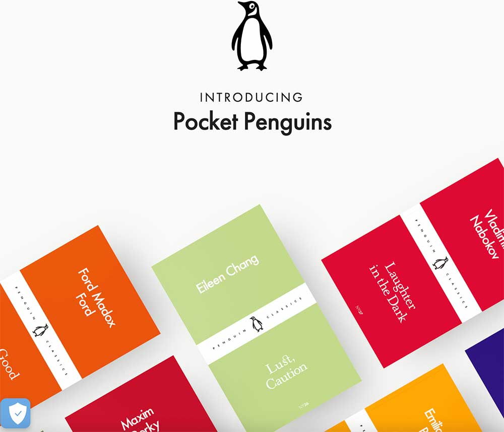
Pocket Penguins, a series of pocket-sized Penguin Classics, puts this concept into action by removing any distractions and putting vibrantly-colored book covers in the spotlight. White space dominates the entire homepage, and the only other elements are clickable book illustrations.
3. Use Images of Real People
Did you know that using a photo of a person on your landing page can boost conversions by a staggering 102.5%?
The latest research by Google shows that people are drawn to faces on web pages.
Therefore, if you want to humanize your design and make it more personal, include more faces on your website.
But, there’s a catch – these faces should belong to real people as stock photos won’t cut it.
There are different ways to implement this tactic, such as showing customers using or unboxing your product, leveraging user-generated content, and publishing testimonials paired with photos of happy customers.
In addition to being more visually appealing, photos of real people will improve the credibility and trustworthiness of your site.
Are you looking to grow your brand online?
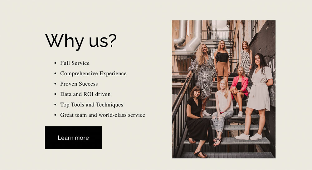
Digitarial Agency puts a face to the name and displays a photo of the entire team on their homepage. That’s how potential clients can see who’s behind the brand and establish an emotional connection more easily.
4. Leverage Augmented Reality
One of the biggest obstacles online businesses face is that their potential customers can’t try on a product they want to buy.
82% of people are more likely to buy after having the opportunity to touch, feel, and see the product in person.
Sometimes visiting a physical store isn’t possible either because it’s on another continent or because the brand operates only online.
In either case, augmented reality can be used to save the day and give conversions a boost. This technology is the next best thing to a genuine in-store experience.
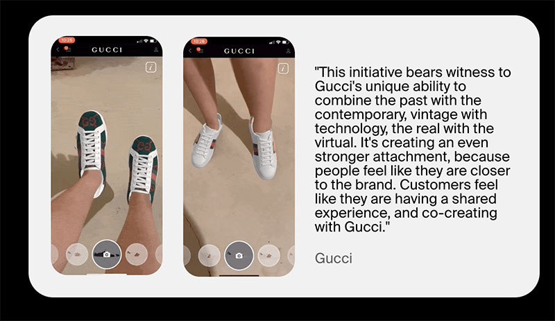
Wanna Kicks is a super useful AR app that helps sneakerheads try on fresh drops and visualize how a particular model would look on them. It’s possible to rotate feet, see sneakers from different angles, or even walk around in them.
5. Make the Most of the “Above the Fold” Space
The above-the-fold space gives you a lot of opportunities to catch your visitors’ eyes right off the bat.
The upper section of your homepage is where people spend 57% of their page-viewing time, so it’s crucial to make good use of it.
This valuable real estate should display your top-priority content that will immediately tell your audience why they should stay and explore your site.
Here’s how you can do that:
- Explain what your brand is all about and what visitors can find if they browse your website.
- Highlight the main benefits of your website and why your audience should stay.
- Include a simple, powerful CTA and make sure it stands out from the rest of the website elements.
- Leverage high-quality images or videos.
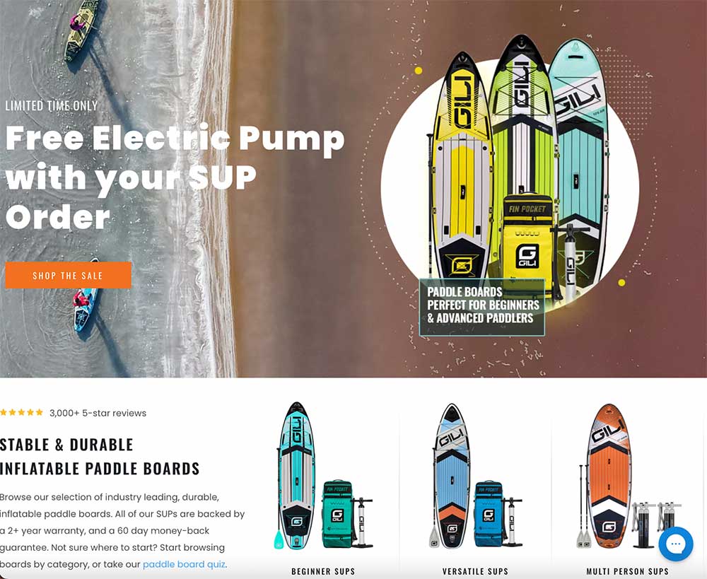
Gili Sports covers all the bases with their above-the-fold content. Visitors who land on their site get all the relevant information about what the brand sells.
Plus, the main headline promotes a limited-time deal that can pique their audience’s interest and prompt them to make a purchase while it’s available. The imagery is attractive with bold colors and well-used white space.
6. Create Compelling CTA Buttons
Call-to-action buttons are among the most powerful conversion drivers.
If you don’t tell your potential customers what exactly you want them to do, they will be confused. CTAs will give them a little nudge and direct them toward the next step you expect them to take.
We’ve mentioned placing your main CTA above the fold on your homepage, but that’s not nearly enough.
High-converting websites use every opportunity to invite their visitors to take action with effective, noticeable, and strategically distributed CTA buttons. So, follow their cue and add at least one well-designed, conspicuous call to action on every web page.
Popups are a great vehicle for CTA placement. While it’s true that they get a lot of bad rap, when properly executed, popups can increase your conversion rates.
When we’re talking about CTA design, the trick is to use a color that is in contrast to the background to make them highly visible. Also, the copy should contain compelling action words such as “Buy,” “Get,” “Download,” “Subscribe,” or “Click.”
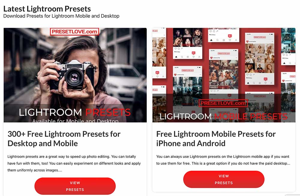
PresetLove features visible, bright red CTAs under every Lightroom Preset category on the homepage. This allows for seamless navigation between different product pages and helps customers easily find what they’re looking for and take action.
Looking to grow your brand online!
Wrapping Up
Website design has a tremendous impact on user experience. The ultimate goal of these tactics is to help you create an attractive website with intuitive navigation that your visitors can easily browse. Remember that less is more in terms of design, so avoid any kind of clutter and try to give value to your audience without overwhelming them with content.
We’re always working on putting out new content covering WordPress, marketing, and SEO news. 100% spam FREE. Join our Newsletter!
We hope that you enjoy our content. If you decide to make a purchase after clicking on one of our affiliate links, we’ll earn a small commission at no extra cost to you. Thanks for reading! View our Affiliate Disclosure
These are all great tips to keep in mind. White space is such an invaluable commodity and it can help with various web design elements, making the user experience that much better.