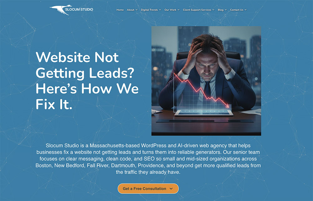
Most Homepages Look Good. Ours Actually Rank and Convert.
Professional web design is a balancing act of aesthetics and authority.
If your homepage is beautiful but invisible on Google, it’s a failed investment. Conversely, if it ranks #1 but has a 90% bounce rate, you’re treading water. At Slocum Studio, we build SEO-first homepages—designed to capture the Google bot’s attention and the user’s trust in the first 3 seconds.
The Slocum Framework: 4 Pillars of a High-Performance Homepage
On-page SEO isn’t just about “ranking”—it’s about revenue. At Slocum Studio, we move beyond basic keyword placement to build a foundation of digital authority. When we engineer a homepage for a web project, we optimize for the four factors Google (and your high-ticket customers) value most:
Strategic Copy Architecture: We don’t just write “content.” We architect semantic relevance using H1-H6 hierarchies and high-intent keywords that tell search engines exactly what you sell and who you serve.
Conversion-First User Experience (UX): A clean design is only half the battle. We ensure your navigation is intuitive, removing the “friction” that causes potential clients to bounce before they ever call you.
Aggressive Speed Optimization: Seconds equal dollars. Leveraging our custom development background, we optimize every graphic and line of code to ensure your homepage loads faster than 90% of your competition.
Domain Authority (DR 72): We leverage our own high-authority standing and technical best practices to help your site earn the backlinks and “trust signals” needed to stay at the top of the search results.
When we design a homepage, we follow a strict “Above the Fold” priority list. “Above the fold” refers to the content a visitor sees immediately before they have to scroll. To stop “treading water” and start generating leads, every homepage we build must include these three elements in the hero section:
The Immediate Hook (Value Prop): A clear H1 tag that tells the visitor exactly how you solve their problem.
The Primary Action (CTA): A prominent button (e.g., “Start a Project” or “Get an Audit”) that is visually distinct and impossible to miss.
Direct Contact Access: Whether it’s a prominent phone number or a “Schedule a Call” link, we ensure your highest-intent leads have a frictionless path to reaching you instantly.
The Anatomy of a Lead-Generating Hero Section
At Slocum Studio, we treat the “Hero Section” (the top area of your homepage) as your most valuable digital real estate. If you don’t capture a lead here, you likely won’t capture them at all. Every SEO-friendly homepage we architect follows this 3-point conversion hierarchy:
1. The Primary Conversion Trigger (The Hook)
We don’t bury the lead. Whether your goal is to grow an email list or secure direct inquiries, your primary call-to-action (CTA) must be the most visually dominant element on the page. We use high-contrast design to ensure the eye is drawn immediately to the “Subscribe” or “Get Started” button.
2. Frictionless Engagement Path
A visitor should never have to search for a way to hire you. We strategically place “Direct CTAs”—such as a high-intent service button or a sign-up link—where they are most natural to the user’s flow. By reducing the number of clicks required to reach a contact form, we significantly increase your site’s overall CVR (Conversion Rate).
3. Immediate Trust & Accessibility
For a professional service business, your phone number or “Schedule a Call” link is a major trust signal. We ensure this is prominent and accessible above the fold. This allows high-intent prospects—those ready to start a web project right now—to bypass the research phase and reach you instantly.
Why This Matters for Your SEO
Google doesn’t just look at keywords; it looks at user behavior. If a visitor lands on your page and immediately finds what they need because of this 3-point hierarchy, your “Time on Page” increases and your “Bounce Rate” decreases. These are the “hidden” SEO signals that tell Google your site is an authority in its niche.
Moving Forward: How to Apply This to Your Site
Audit Your Fold: Open your website on a mobile device. Can you see your primary CTA and a way to contact you without scrolling? If not, you are losing leads.
Match Imagery to Intent: Don’t use generic stock photos. Your imagery should immediately validate that the user is in the right place.
Keep it Clean: A cluttered hero section is a confused visitor. We specialize in “minimalist authority”—giving the user exactly what they need to make a decision, and nothing more.
Measuring What Matters: Engagement over Vanity
Most business owners look at “Traffic,” but traffic doesn’t pay the bills. We focus on engagement rate and Meaningful Sessions. If a visitor leaves your site in under 15 seconds, you’ve “bounced.” A high bounce rate is usually a symptom of a poorly constructed homepage or a “Speed Gap.” At Slocum Studio, we use advanced analytics to track:
Scroll Depth: How far down are they actually reading?
Conversion Paths: Where exactly are they clicking “Contact”?
Technical Latency: Is a slow-loading image causing them to leave before the page even finishes?
We don’t just give you a report; we give you insight. We turn those raw numbers into a strategy to keep visitors on your site longer, increasing the likelihood of a project inquiry.
Conversion Architecture: Turning Browsers into Buyers
A Call to Action (CTA) is more than just a “Contact Us” button. At Slocum Studio, we treat CTAs as the “final destination” of every page. We don’t believe in passive design; we believe in conspicuous, clear, and compelling triggers that guide a user to the next step.
Strategically Placed CTAs
We don’t just put a button at the bottom and hope for the best. We analyze the user’s journey and place “Interrupter CTAs” at the exact moment they’ve seen enough value to make a decision. Whether it’s a link to a specialized service page or a direct “Discovery Call” scheduler, every button on your homepage has a measurable job to do.
Social Proof: The “Trust” Factor
Design and SEO get people to your site, but Social Proof makes them call you. We strategically integrate customer reviews and video testimonials right next to your primary CTAs. This creates a “trust loop”—the visitor sees the value, sees that others have succeeded with you, and feels confident taking the final step.
A Note on Keywords: Moving Beyond the “No-Brainer”
In the past, you might have thought your keywords were a “no-brainer.” But in the 2026 search landscape, broad keywords are dead. You don’t just want to be found; you want to be found by people ready to invest.
At Slocum Studio, we move beyond simple terms like “web design” to find High-Intent Long-Tail Keywords. We use advanced planning tools to identify what your specific customers are searching for when they are ready to hire. We then add these to your header tags and content so Google sees you as the best solution, not just a “site.”
Building Authority Through Social Proof & Strategic Keywords
Design and SEO get people to your site, but Social Proof is what makes them pick up the phone. At Slocum Studio, we don’t just “add testimonials”—we strategically place client success stories and video case studies right next to your primary conversion points. This creates a “trust loop”: the visitor sees the value, sees that others have succeeded with you, and feels confident taking the final step.
Beyond Basic Keywords: Targeting Intent
Many business owners make the mistake of chasing “no-brainer” keywords that are too broad to convert. For example, ranking for “web design” is great, but ranking for “Custom WordPress Development for [Your Industry]” is profitable.
At Slocum Studio, our keyword strategy goes deeper:
Subset Targeting: We identify the specific niche services that your competitors are overlooking.
Long-Tail Optimization: We capture users who are further along in the buying cycle—those searching for specific solutions rather than general information.
Semantic Relevance: We ensure your homepage speaks the language of both your customer and the Google algorithm.
Stop guessing. Start Growing.
Knowing which keywords to target is the foundation of every project we manage. When you partner with us, we don’t just ask for your “ideas”—we provide a data-backed keyword roadmap designed to steal market share from your competitors.
8 PRO TIPS on Front Page Design
The Technical Foundation: Speed, Structure, and Visual Authority
A beautiful homepage is useless if it’s slow or structurally unsound. At Slocum Studio, we treat the technical “under-the-hood” elements of your site with the same importance as the visual design.
Semantic Header Hierarchy
We don’t just use Header Tags (H1, H2, H3) for styling; we use them to communicate your site’s hierarchy to search engines. By strategically organizing your content, we ensure that Google understands your primary services immediately. While others guess at header optimization, we architect it to maximize both readability and crawlability.
Visual Authority & Image Optimization
Great imagery sets the tone for your brand, but unoptimized files kill your conversion rate. We recommend professional photography for all primary landing pages to establish instant trust.
However, visual quality must be balanced with performance. We use advanced Image Compression and modern formats to ensure your visuals are crisp but lightweight. We handle the heavy lifting of alt-tagging and technical sizing to ensure your images contribute to your SEO rather than hindering your site speed.
Proven Performance: The 1-Second Standard
Speed is a primary ranking factor in 2026. In our recent performance tests, we’ve demonstrated that technical optimization can reduce page load times by over 90%.
Before Optimization: 2.69 Seconds
Slocum Optimized: 1.4 Seconds
Result: A frictionless user experience that keeps visitors engaged and significantly reduces bounce rates.
Wrapping Up: Stop Treading Water with a “Template” Homepage
Building an SEO-friendly homepage requires more than just a WordPress theme; it requires a strategic marriage of design, technical performance, and conversion psychology.
Overall, your homepage should be clean, fast, and engineered to drive your Unique Selling Proposition (USP). The more you plan for performance, the more your digital investment will pay off in actual leads and revenue.
SCHEDULE YOUR FREE DISCOVERY SESSION TODAY
OR CALL: 857-400-8959


