
Author Bio: Mark Medeiros is a “jack of all trades” and the founder of Slocum Studio. He loves photography, nature, and kayaking on the river. Mark enjoys blogging, online marketing, and his clients. Who’s doing this write-up anyway:)
This blog post is about a 12-minute read. I cover essential topics on e-commerce website development solutions to help you create a nicely designed and functional e-commerce website.
Let’s get to it!
You know the saying: If you’re going to do something, do it, right?
You’re probably thinking, “How do I do it right when I don’t know what’s right?” That’s a good question!
Let’s start with a call I received from my friend, Dan.

Dan is a full-blooded (DIY) do-it-yourself person.
He’s very talented at making things. Things of steel and shaping them into products that he sells.
Mark, “Dan said”, I have started building an e-commerce website and would like you to take a look.
I was pretty surprised that he would take this on himself, and my first impression of his website wasn’t a good one.
The font size, theme colors, header titles, and imagery cried out, “Help me.” And I could tell he had done little to no research before starting the project.
Just because your good at some things doesn’t mean you can Design an e-commerce website!
Fonts, Theme Color, Header Tags, and High-Quality Photography
Why font choice matters
Font choice and size play a pivotal role in the overall user experience of an e-commerce store. When customers visit an e-commerce store, the typography serves as a silent communicator, setting the tone and mood of the platform.
A well-chosen font can evoke trust, professionalism, and reliability, while a poorly chosen one can create confusion or mistrust. The size of the font is equally crucial. Too small, and users may struggle to read product descriptions or navigate the site, leading to potential loss of sales. If it is too large, the site can appear cluttered and overwhelming.
Moreover, with the diverse range of devices used to access e-commerce stores, from desktops to mobile phones, fonts must be legible and scalable across all screens. The proper font choice and size enhance aesthetics and functionality, ensuring customers have a seamless and pleasant shopping experience.
Website Theme Colors
In web design, choosing theme colors is not merely an aesthetic decision but a strategic one that can significantly impact user experience and engagement. Colors can evoke emotions, influence perceptions, and guide user behavior.
For instance, a well-chosen color palette can create a sense of trust, excitement, or calmness, depending on the brand’s intent and target audience. Best practices in web design emphasize the importance of using colors that align with a brand’s identity and values, ensuring consistency and recognition across all digital touchpoints.
Moreover, the proper contrast between background and text colors is crucial for readability and accessibility. Poor color choices can lead to user strain or misinterpretation of content.
Additionally, using colors strategically can guide users’ attention to specific call-to-action buttons or essential information. Adhering to best practices in color selection is fundamental in web design, as it directly influences user satisfaction, conversion rates, and overall website effectiveness.
Header Tags
Header tags, ranging from H1 to H6, are a foundational element in web design, serving aesthetic and functional purposes. At a basic level, they structure content, making it more digestible and organized for readers. This organization is particularly crucial on product pages, where clear delineation between product names, descriptions, reviews, and other elements can make the difference between a sale and a bounce.
Beyond aesthetics, header tags play a pivotal role in enhancing user experience. They guide visitors through the content hierarchy, allowing them to identify and navigate to sections of interest quickly. This streamlined navigation is especially vital in an era where users have short attention spans and expect immediate access to information.
Furthermore, header tags are essential for SEO. They help search engines understand the content structure, which can lead to better rankings. In essence, the strategic use of header tags in web design ensures that users and search engines can efficiently navigate and interpret content, optimizing user experience and visibility on product pages.
High-Quality Photos
High-quality photos are a cornerstone of effective web design, acting as visual ambassadors for a brand or product. In the digital realm, where tactile interaction is absent, visuals become the primary sensory experience for users. Especially regarding product images, high-quality photos can make or break a user’s decision to engage or purchase.
These photos offer a detailed, clear, and accurate representation of products, allowing users to inspect features, textures, and colors. A grainy or poorly lit image can doubt a product’s value or the brand’s professionalism, while sharp, well-composed photos can instill confidence and trust.
Moreover, high-quality photos enhance a website’s overall aesthetic appeal, elevating its design and providing a more immersive user experience. They capture attention, convey emotions, and tell stories. Investing in high-quality photos is not just about aesthetics; it’s a strategic move that can significantly impact user engagement, trust, and conversion rates in web design.
So there you have it, four essential elements to use for your e-commerce web design. Later in this post, I’ll share what I did for my friend Dan and how he’s doing online.
Don’t be a Dan unless you can answer these fundamental questions.
- Are you good at research?
- Do you know what CMS to use?
- Have you designed a website before?
- Do you have some basic page optimization skills?
- Do your product photographs look professionally done?
e-commerce website development solutions
Description List: (Tap the line to move down to the subject title)
- Make an excellent first impression with web visuals.
- What CMS to use?
- Is WordPress Secure?
- WooCommerce
- How to Setup a Blog
- What you need to know about SEO
Think any old website design will do for your business– Read this.
It takes less than two-tenths of a second for an online visitor to form a first opinion of your brand once they’ve perused your company’s website.

And it takes just another 2.6 seconds for that viewer’s eyes to concentrate in a way that reinforces that first impression.
Are You Looking to Grow Your Brand Online?
1. Make an excellent first impression with web visuals
You know how this works– right? You meet someone for the first time, or you look at an apartment, car, or website, and what comes to mind?
Yes, that first impression, where you say, “Nah, I don’t think so.”
But what if you spent time talking to the person, walking through the apartment, sitting in the car, and going through the website? That would mean you liked what you saw, and the visuals must have been interesting enough to keep you looking.
The tracking study at Missouri S&T’s Lab found that people spent about 2.6 seconds scanning a website before focusing on a particular section.
The longer a visitor stays on your webpage, the chances are the more they like it. And time on page may increase the page rank.
Be sure to design for visual consistency. You learned from the example above that people rely heavily on sight when interacting with a website, and visual design plays a key role.
The homepage or landing page is usually the first page visitors see and will be the last if they don’t like it. The more aesthetically designed the page is, the more they will stick around.
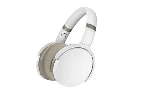
If you are selling a product, please use professional photography! Image sells; lousy photos do not.
To play it safe, you might consider using a ready-made theme (sort of), but you will have to make it your brand. I recommend Astra Themes if you go that route.
Suppose you have developer skills and want to code and design an e-commerce website; great! But if you plan to pay someone, prepare for the price. I have more on this subject below.
Apple white and the use of white space in your design
Is Apple successful because they use lots of white space on their website between their products? No, but I can say this: it doesn’t hurt them.
White space is powerful; when applied correctly, it can become an integral part of your design. And it does a great job holding images, graphics, and text together on a page.
It will also help you with spacing and produce a more consistent design, which goes a long way toward creating a good user experience UI.
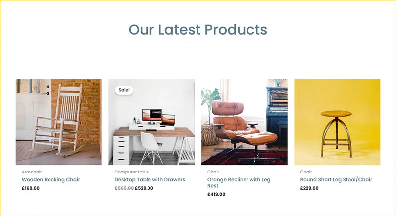
White space can significantly impact your design’s perception and benefit your brand positioning.
Amazon is a case in point. There is a good amount of white space but great use of color. Orange is used for star reviews, best sellers, and add-to shopping carts.
Adding clean, crisp fonts, professional photography, and ample white space can make your web page look classy.
Using white space around a product typically leads to a visitor looking at the product. Nothing else attracts their eye, which is a good thing.
2. What CMS to use?
Looking to Design an e-commerce website, use WordPress. I am biased, but I know that. Still, there are many advantages to using WordPress.
There are currently more than 455 million websites running on WordPress.
And I talk about WordPress and the benefits of the CMS all the time. I work on WordPress every day in my line of work. I know there are some haters out there, but facts are facts.
WordPress is the most popular website-building platform in the world. And for a good reason! WordPress powers nearly 44% of all websites on the internet. And almost 15% of the world’s top websites.
WordPress is affordable, easy to use, works perfectly with Woo-Commerce and all its plugins.
Another great feature is that WordPress is search engine friendly. This means you will have a better chance of ranking in search results. Is WordPress secure?
Are You Looking to grow your brand Online?
3. Is WordPress Secure?
Is WordPress secure? Yes, WordPress is secure partly due to the thousands of developers that audit the platform daily.
The bottom line, no one can fully guarantee that WordPress or any other CMS is entirely safe.
I think a modest risk factor might be in the use of plugins. In a study by Wordfence, over 55.9% of WordPress website owners determined that hackers entered their websites from plugin vulnerabilities.
I like to keep my plugins updated; when I research a plugin, I always check the revision dates to ensure they keep it up.
E-commerce website design
WooCommerce is an e-commerce plugin for WordPress that you will want to use if you consider making an e-commerce website. With nearly 30 million downloads, WooCommerce powers 99% of all WordPress stores.
Remember when you need to Design an e-commerce website? WooCommerce was made for selling and includes everything needed to get up and running.
Many accessory plugins work with Woocommerce, making building a fabulous shopping website easy.
What are some of the features and benefits of using WooCommerce?
Most retailers looking to purchase a platform for their stores consider the cost. E-commerce applications range from free to thousands of dollars. Since WooCommerce is free, it comes in near the of the list.
1. It’s free– The fact that it is free is a low entry bar, so any business can take advantage with no need to commit to software licenses or support contracts.
Remember that third-party applications and extensions may cost money, so you must evaluate this depending on your store’s needs.
2. WooCommerce is modular– given a community of developers who build extensions to add specific WooCommerce functions is something that is not possible with a monolithic application (built as a single unit).
With the right combinations of plugins, such as shipping, payments, Packing slips, and custom product tabs, Woocommerce is a powerhouse.
3. WooCommerce Grows with your business– When choosing an online selling application, it’s always a good practice to forecast. And developing a growth strategy could be very helpful in the future.
Looking to grow your brand online!
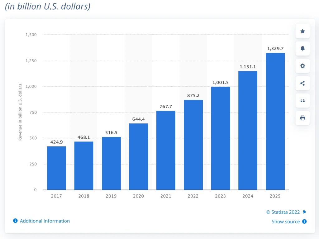
Revenue from retail e-commerce in the United States was estimated at roughly 768 billion U.S. dollars in 2021. The Statista Digital Market Outlook forecasts that 2025 online shopping revenue in the U.S. will exceed 1.3 trillion dollars.
Should You Choose WooCommerce To Run Your Online Store?
WooCommerce is a free plugin for WordPress. It provides a fast and easy way to set up your online store and start selling in no time. WooCommerce can be set up to sell just about anything, including digital products, subscriptions, memberships, appointments, and more.
Here are some example sites that use the WooCommerce platform.
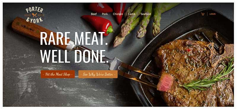
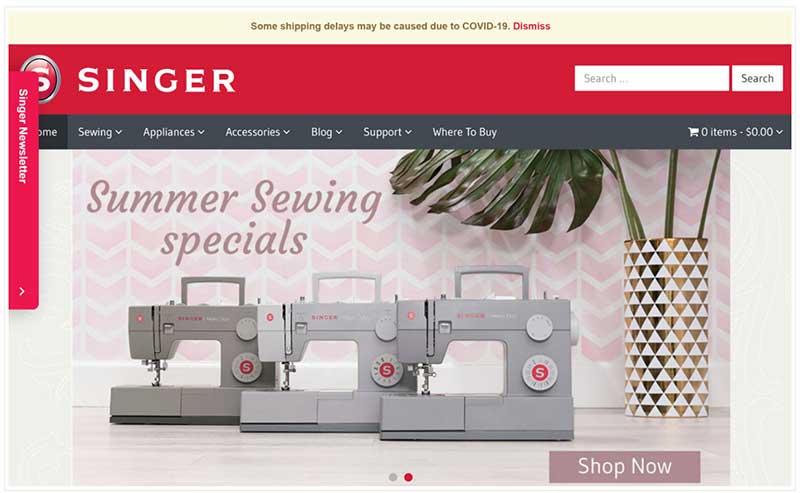
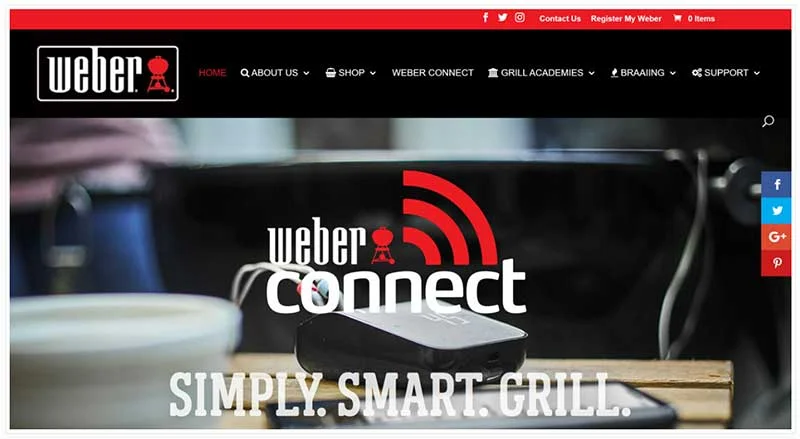
One of the benefits of WooCommerce is that it can scale from a tiny store with a few products to an immense store with hundreds of shoppers per second!
5. How to Setup a blog
Hey, listen, don’t tell me it’s a ton of work, your preaching to the quire!
Anyone who wants a successful online business needs to consider a blog. Blogs can be very beneficial in driving traffic to your site.
Think about a place to do product reviews with links over to the product page. Are you kidding me?
Having a blog may help you curb low conversion and cart abandonment rates.
Did you know that 81% of shoppers conduct online research before making a big purchase? (according to Retailing Today). Your blog is where you can write reviews of your product.
The average e-commerce conversion rates vary from 2.8% to 4.5%.
Only about 22% of businesses are satisfied with their conversion rates.
Mobile commerce makes up 30% of all U.S. e-commerce. By 2025, more than ten percent of all retail sales in the United States will be generated via mobile commerce. This figure would represent a growth of almost seven percentage points since 2018. M-commerce accounted for nearly six percent of all retail sales in 2021.
Plan out your blog post before you start writing, or you could end up with some rambling content.

Looking to grow your brand online!
Follow These Three Steps:
First, you need to plan what you want to write. If you own an e-commerce store, it will probably be about your product. In this case, it will be about e-commerce website development solutions. If it’s not, then it should be something you know. Quality before quantity; quality content is the goal.
Second, research the title and what you want to write. You could search Google Trends, competitor websites, Amazon book titles, etc.
The third step is nailing down the title. Be sure to include your keyword in the page title. If necessary, you can use a hyphen or a colon in your headline to improve clarity. If possible, try to place your keyword before the hyphen and the colon.
6. What to know about SEO
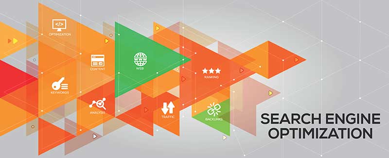
This section can be highly technical, but I’ll do my best to simplify it by breaking it down into three categories.
- Technical SEO
- On-page SEO
- Off-page SEO
Technical SEO:
This is how search engine bots crawl and index a website.
According to BrightEdge, 68% of all online experiences start with a search engine, and 53% come from organic search.
Considering that only 0.78 percent of these searches click results on the second page of Google, you’re not getting traffic if you’re not showing up on the first page.
Technical SEO is where optimizations can improve search engine ranking by making your site easier for search engines to crawl—things like improving site load times, checking robot.txt files, and making redirects.
There is much more to technical SEO than I have time to write or for you to stick around and read. But if you sign up for my newsletter, you will get updated on my posts.
To name a few, I have listed them below.
- mobile optimization
- page load speed
- Link health
- duplicate content
- schemas
- crawl errors
- image issues
- URL Structure
- 404 pages.
- XML sitemaps
On-page SEO
is how well the content on the site is optimized for target keywords and user experience.
Google has released several updates to its search algorithms over the past few years. These updates set augmented rules on how website owners should structure their sites for link building, building incoming links, and using anchor text for outgoing links.
BrightEdge Research found that Organic and Paid Search dominated websites’ traffic in 2019 – 68% of all trackable website traffic is sourced from Organic and Paid Search, vastly exceeding all other channels, including Display and Social Media. DOWNLOAD STUDY
On-page SEO, however, even after these updates, hasn’t changed that much. But doing on-page SEO is beneficial if you want your pages to rank.
Page speed or page load time is an important metric. Studies show that a delay of even 1 second in page response time can cost 7% fewer conversions.
Meta tags and their effects have changed, but I would pay attention to them and write the descriptions correctly. If the title of your page or keyword is something like “Design an e-commerce website,” be sure to include it in the meta tag.
Title tags are another essential element of your page. Be sure they are short and descriptive. The title shouldn’t duplicate the page content.
Content that drives search traffic involves using researched keywords, phrases, and long-tail anchor words. The more descriptive in-depth content, the more traffic you will create. Avoid fluff; no one has the time to read boring stuff.
Content that drives traffic should be–
- Interesting to read
- written with the visitor in mind
- in-depth and well-written
- easy to share
- optimized for a high-volume keyword
- Oh, and it solves a problem
Off-page SEO
This is how other websites link to your website to boost its authority.
One of the most important Google ranking factors isn’t found on your website pages, but it’s from backlinks from their websites pointing towards your website.
Off-page SEO tells Google what others think about your website. It means the more valuable links pointing to your pages, the search engines will assume you have great content that is interesting to viewers.
Your Internal Pages
Optimizing internal pages can make a big difference in your overall rankings. This includes interlinking your pages using random keywords; emphasize your brand name. This is important if you are planning to design an e-commerce website.
The number of internal links to a page indicates its importance relative to other pages on the site. According to Brian Dean’s Googles 200 Ranking Factors
Be careful when doing this so you’re not creating broken internal links.

Like this blog post?
Are you interested in maximizing your online growth? We can help with Web Strategy, Web Design & Development, SEO, and content writing. Talk to Us! Call: (857)400-8959
Backlinks
Remember, Off-Page SEO is the activities that you and others do away from your website, like asking another website owner if you can write a guest post for the blog on their website. And they will ask you if they can write a post for your blog.
Backlinks are a well-known ranking factor; if a page has many external links pointing to it, its authority grows, and Google promotes it in the search results.
In January 2022, Google processed 12.1 million search queries! That is a lot of searches! And this is why backlinks are the number one ranking factor.
The short story for backlinks is the more you have going to a page, the more authoritative and valuable it will be.
Backlinking requires a plan, so you must know a few things before Google crawls your pages.
- Is the link fresh
- Is it a quality link?
- Why did the site owner link to your post?
- Where does the link come from?
You must be careful not to get on Google’s penalty radar. This can happen with spammy backlinks.
Book a discovery session to learn more about backlinking.
Again, this section can get deep, and while I have written 4,000-word posts on my site, I don’t intend to turn this post into one of them. If you plan to an e-commerce website development solutions, sign up for my stay connected block below.
So, if you read this far down, you probably want to know what I did about my friend Dan. We built a nice, clean (smallish) e-commerce website for him. He has about ten products on the site, and in the first half of the year, he sold about 75 thousand dollars in a side hustle.
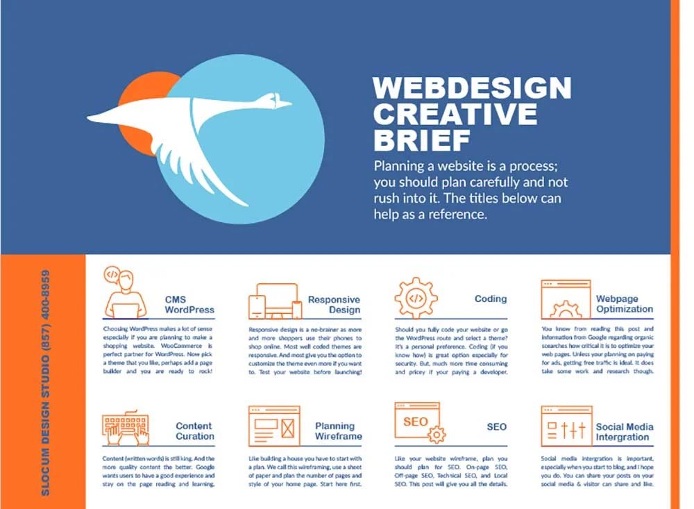
DOWNLOAD PDF
Let me know what you think about this post; I would be interested if you want to design an e-commerce website. Please tap stay connected to receive blog posts and information about e-commerce.

We hope that you enjoy our content. If you decide to make a purchase after clicking on one of our affiliate links, we’ll earn a small commission at no extra cost to you. Thanks for reading! View our Affiliate Disclosure


Thank you very much for this amazing post. I admire your inspiring and motivating works and I would love to read more of your great article.
Great article — really useful and well‑structured! You clearly explain how elements like typography, color scheme, layout, and professional photography can make or break an e‑commerce store’s first impression.